Coca-Cola Brand Identity Refresh Sparks Comparisons to Marlboro Cigarette Typography as Design Critics Weigh In on Retro Serif Aesthetic

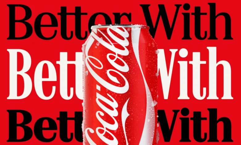
The Coca-Cola Company has officially unveiled a comprehensive refresh of its global brand identity, a strategic design overhaul spearheaded by the renowned creative agency Jones Knowles Ritchie (JKR) with a specialized focus on bespoke typography. Central to this new visual language is the expanded implementation of the "Better With" typeface, a custom-designed serif family developed for the beverage giant by Brody Associates in 2023. While the identity was intended to evoke a sense of heritage and "playful movement," the rollout has triggered an immediate and widespread comparison among design enthusiasts and social media commentators to the iconic branding of Marlboro cigarettes. The unexpected visual parallel has ignited a broader conversation regarding the intersection of branding, consumer psychology, and the historical associations between high-sugar products and the tobacco industry.
The "Better With" typeface was originally commissioned as a secondary element for a 2023 holiday marketing campaign. However, under the new creative direction established by JKR, the font has been elevated to a primary role across Coca-Cola’s global marketing collateral and product packaging. According to Brody Associates, the creative brief necessitated the development of a serif font family that could express "the brand’s unique personality, movement, and playfulness." The studio stated that the design was heavily influenced by Coca-Cola’s extensive historical archives, blending "rich serif font heritage with modern-day requirements" to add layers of storytelling to the brand’s visual output.
Despite these intentions of heritage-based storytelling, the public reaction has centered on the undeniable resemblance to the typography utilized by Philip Morris International for its Marlboro brand. The Marlboro font, a customized version of a neo-gothic or heavy serif style, has long been associated with the "Marlboro Man" era of advertising, characterized by bold, high-contrast letters set against a stark red-and-white background. Social media users on platforms such as X (formerly Twitter) and TikTok were quick to point out that the combination of Coca-Cola’s signature red color palette and the new, retro-styled serifs created a visual shorthand that mirrors the world’s most recognizable cigarette pack.
The irony of this comparison has not been lost on health advocates or market analysts. For decades, public health experts have drawn parallels between the marketing strategies of "Big Soda" and "Big Tobacco," noting that both industries have historically relied on heavy branding to sell products linked to long-term health risks. The adoption of a visual style that subconsciously or overtly mimics tobacco branding is being viewed by some as a moment of accidental self-awareness. One widely circulated comment on social media suggested that Coca-Cola "leaning into" the cigarette aesthetic was a logical progression, given that sugary carbonated drinks are increasingly viewed through the same regulatory and health-conscious lens as nicotine products.
A Chronology of the Visual Shift
The evolution toward this new identity began in early 2023 when Coca-Cola sought to move away from the "blanding" trend—a period in the 2010s where many global corporations adopted minimalist, sans-serif logos. The company engaged Brody Associates, led by the legendary typographer Neville Brody, to create a font that felt more human and less corporate.
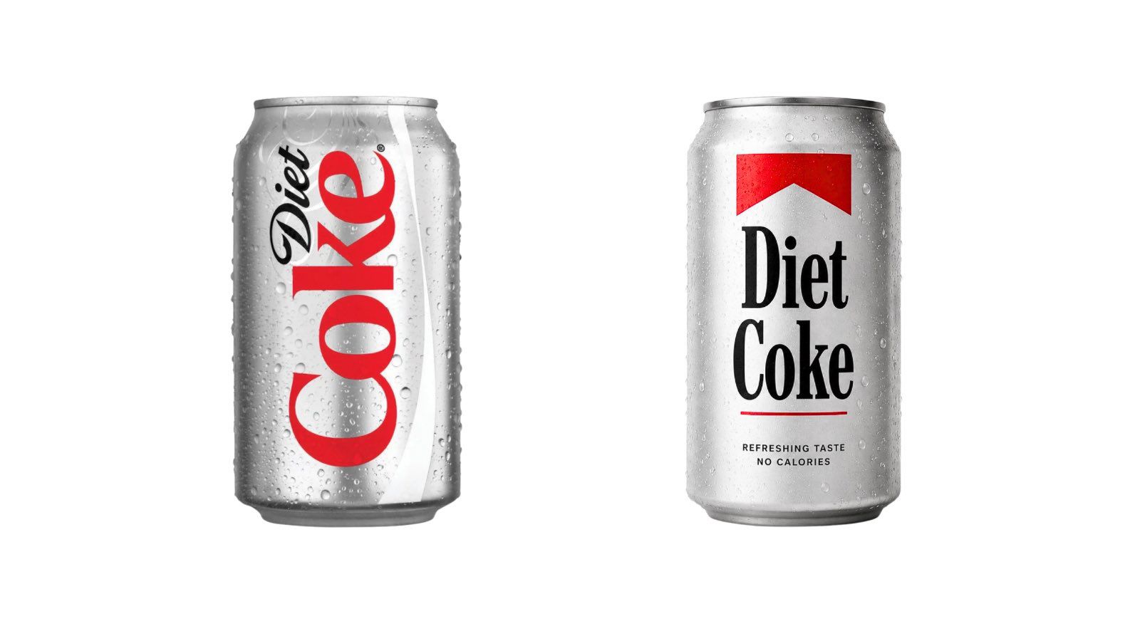
By the fourth quarter of 2023, the "Better With" font appeared in limited holiday-themed advertisements, paired with illustrations of food and family gatherings. The goal was to emphasize that meals are "better with" a Coca-Cola. In early 2024, JKR was tasked with integrating this typeface into a cohesive global system that could work across digital, print, and physical packaging. This overhaul included a more prominent placement of the serif font on Diet Coke cans and promotional billboards, moving the brand away from its reliance on the classic Spencerian script for secondary messaging.
By July 2024, as the full identity became visible in major metropolitan markets, the Marlboro comparisons reached a fever pitch. This coincided with a viral TikTok trend where younger consumers referred to Diet Coke as a "fridge cigarette"—a term used to describe the beverage as a zero-calorie "vice" or a ritualistic break similar to a smoke break. Analysts suggest that while Coca-Cola likely did not intend to mimic tobacco branding, the cultural zeitgeist had already linked the two products in the minds of Gen Z and Millennial consumers.
The Design Theory: Why the Resemblance Exists
From a technical design perspective, the similarity stems from several key typographic markers. Both the "Better With" font and the Marlboro typeface utilize high-contrast serifs, where the difference between thick and thin strokes is pronounced. They both feature "ball terminals" (the rounded ends of letters like ‘c’ or ‘r’) and a vertical axis that suggests a mid-20th-century editorial style.
Furthermore, the color theory involved is identical. Both brands utilize a specific shade of high-saturation red paired with stark white. In the world of color psychology, red is used to stimulate appetite, convey urgency, and project a sense of power. When this color is applied to a bold, traditional serif font, the brain automatically references existing cultural icons that share those traits. For most of the 20th century, Marlboro was the primary occupant of that specific visual real estate in the consumer consciousness.
The Regulatory and Health Context
The branding shift arrives at a sensitive time for the soft drink industry. Governments worldwide are increasingly treating sugar as a controlled substance through taxation and labeling requirements. In the United Kingdom, the Soft Drinks Industry Levy (often called the "sugar tax"), introduced in 2018, has forced many manufacturers to reformulate recipes or face significant price hikes. Similar measures have been adopted in Mexico, South Africa, and several major U.S. cities, including Philadelphia and San Francisco.
Data from the World Health Organization (WHO) indicates that the global prevalence of obesity has nearly tripled since 1975, with sugary beverages cited as a primary contributor. As a result, the "de-normalization" of soda consumption is a stated goal of many public health departments. This regulatory environment mirrors the trajectory of the tobacco industry in the 1990s, where branding was restricted and health warnings became mandatory. By adopting an aesthetic that recalls the "golden age" of tobacco advertising, Coca-Cola risks reinforcing the perception that its products are an addictive, legacy vice rather than a modern, healthy lifestyle choice.
Industry Reactions and Market Implications
Design critics have been divided on the success of the JKR overhaul. Supporters argue that the new identity is a masterclass in "New Retro," a movement that seeks to reclaim the warmth and character of pre-digital design. They point to JKR’s successful 2021 rebrand of Burger King, which utilized a 1970s-inspired palette and rounded typography to great acclaim, as evidence that nostalgia-driven design can drive sales.
However, detractors suggest that the "Better With" typeface is too close to the "danger zone" of tobacco associations. "In branding, you want to own a category, not be mistaken for another one—especially one with the negative baggage of the cigarette industry," noted one design consultant in an industry forum. "The serif is beautiful, but the context is fraught."
For Coca-Cola, the stakes are high. The company reported a net income of over $10 billion in 2023, but it faces constant pressure to remain relevant to younger, more health-conscious demographics. While the "Better With" campaign seeks to position the drink as a culinary companion, the visual association with Marlboro may alienate the very consumers who are trying to distance themselves from "unhealthy" legacy brands.
Conclusion: The Future of the Identity
As of late 2024, Coca-Cola has shown no signs of pivoting away from the JKR-designed identity. The company continues to roll out the "Better With" typeface across international markets, betting that the strength of its own brand equity will eventually overshadow the tobacco comparisons.
The situation serves as a potent case study in modern branding: even the most meticulously researched design, rooted in a brand’s own historical archives, cannot exist in a vacuum. In a hyper-connected digital landscape, consumer perception is shaped as much by memes and cultural associations as it is by the intentions of creative directors. Whether the "Better With" font becomes a classic staple of the Coca-Cola identity or a cautionary tale of "unfortunate resemblance" remains to be seen. For now, the "fridge cigarette" meme continues to thrive, fueled by a typeface that, intentionally or not, has tapped into a deep-seated cultural link between two of the most successful—and controversial—brands in history.