
Despite broad browser support and significant anticipation from the developer community, CSS Container Queries remain a paradox of modern web development: they are highly sought after, yet significantly underutilized in production environments. While media queries have served as the cornerstone of responsive design for over a decade, their reliance on the viewport as the sole arbiter of layout logic has created architectural bottlenecks for complex, component-based web applications. As web architecture shifts toward modular design systems, the industry is reaching a consensus that container queries represent the next evolution of responsive styling, though widespread adoption has been hindered by a misunderstanding of their functional divergence from established norms.
The Evolution of Responsive Web Design
The timeline of responsive design is defined by the introduction of the media query in the CSS3 specification. In 2010, Ethan Marcotte famously synthesized the principles of fluid grids, flexible images, and media queries, establishing the "responsive" paradigm that would dominate the next fifteen years. At the time, this was revolutionary; it allowed developers to create a single codebase that adapted to the burgeoning diversity of mobile, tablet, and desktop screen sizes.
However, the rapid proliferation of device form factors created a "viewport trap." By 2026, industry data indicated that developers were attempting to support over 2,300 unique viewport dimensions. Relying on the viewport as a proxy for layout was effective when web pages were monolithic, but it proved insufficient for modern, encapsulated components. A card component designed for a main content area often breaks when placed in a sidebar or a narrow grid cell, regardless of the overall viewport width. This disconnect led to the CSS community’s long-standing demand for "element queries," a feature that would eventually manifest as the Container Queries specification.

Data-Driven Adoption Trends
Despite the feature reaching approximately 94% browser support across all major engines—including Chrome, Edge, Firefox, and Safari—the industry has been slow to pivot. According to the 2025 State of CSS survey, while 86% of professional developers are aware of container queries, actual implementation remains at 41.4%.
Experts have expressed concern over this lag. During the 2026 SmashingConf in Amsterdam, CSS advocate Kevin Powell noted that the adoption rate is inconsistent with the long-term industry demand. This reluctance is largely attributed to a cognitive hurdle: because the syntax of @container mirrors that of @media, many developers assume they are interchangeable. This assumption often leads to poor implementation, as developers attempt to use container queries for global layout control rather than component-specific responsiveness, leading to confusion and, ultimately, a retreat to legacy methods.
Technical Divergence: Viewport vs. Container
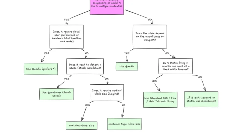
The fundamental distinction between the two technologies lies in their point of reference. Media queries are outward-facing; they ask the browser, "What are the dimensions of the device window?" In contrast, container queries are inward-facing, asking, "How much space is available within this specific parent element?"
When a developer uses a media query, they are effectively hardcoding assumptions about the page structure. If a card is styled to be a horizontal flex layout at 1024px, that style will trigger even if the card is relegated to a 300px-wide sidebar. This results in visual deformation and content overflow. Container queries solve this by decoupling the component from the global environment. By assigning a container-type to a parent element, the component becomes "context-aware," allowing it to resize itself based on the local availability of space rather than the total size of the browser window.

Implications for Modern Frontend Architecture
The shift toward container queries has profound implications for the maintenance of design systems. In the current era of component-based frameworks like React, Vue, and Svelte, the goal is to create highly portable, reusable UI elements. Media queries represent an "anti-pattern" in this context because they introduce dependencies on the global CSS environment.
When a component relies on container queries, it can be dropped into any parent container—a sidebar, a modal, or a full-width grid—and will automatically adjust its layout to fit that space. This eliminates the need for "modifier classes" or redundant media query overrides that typically bloat stylesheets. Furthermore, the introduction of container-relative units (such as cqi for inline size and cqb for block size) enables fluid typography that scales in proportion to its parent container, a significant improvement over vw or vh units which were notoriously difficult to manage within constrained sub-layouts.
Addressing Implementation Caveats
Despite their utility, container queries introduce specific architectural constraints that developers must respect. A common point of friction is the "infinite loop" scenario: a container cannot query itself. To apply styles based on a container’s size, there must be a clear parent-child relationship in the DOM. Developers who attempt to style an element based on its own dimensions—rather than the dimensions of its parent wrapper—will find the syntax ineffective.
Furthermore, there is a technical limitation regarding the use of custom properties. Because container queries function within a specific scope and can trigger style changes that affect the cascade, the specification currently prohibits querying against custom property values (CSS variables). This is a safety measure intended to prevent recursive layout cycles that could crash browser rendering engines. Additionally, developers must exercise caution when using container-type: size, as this can cause the container to collapse to a height of 0px if it lacks defined dimensions, as the container effectively ignores the size of its internal children.

The Future of Component-Based Styling
As the web continues to fragment across an increasing array of devices—ranging from smartwatches and foldable phones to massive ultrawide monitors—the limitations of the viewport-centric model will only become more apparent. The industry is currently moving away from the "macro-layout" approach, where the entire page structure is dictated by a single set of global breakpoints. Instead, the future favors a "micro-layout" approach, where individual components manage their own responsiveness.
The transition to container queries is not merely a syntactic change; it represents a fundamental shift in how developers conceptualize the web. By focusing on the container as the source of truth, designers and developers can build more resilient, modular, and maintainable interfaces. While the learning curve associated with abandoning the "media query habit" is non-trivial, the efficiency gains in component reusability and the reduction of layout bugs suggest that container queries will eventually become the standard for professional web development.
In conclusion, the widespread skepticism or hesitation toward container queries is largely a byproduct of legacy habits. As design systems mature, the necessity of context-aware components will force a migration away from global viewport checks. The tools to build truly modular web environments are already here, natively supported, and waiting for the industry to align its practices with the capabilities of modern CSS.