Beyond the Swatch: What Millions of Paint Samples Reveal About America’s Changing Interior Design Palettes

For generations, the narrative of interior paint trends has been dictated from the top down. Paint manufacturers, color forecasters, and high-end interior designers routinely publish annual color predictions well before the average homeowner picks up a roller or brush. These prognostications—often highlighting a single "Color of the Year"—tend to focus on final purchases or aspirational design concepts. However, a newly released data set offers a radically different lens through which to view American design preferences: looking not at what people ultimately buy, but at the experimental phase that precedes every renovation.
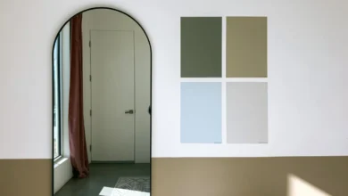
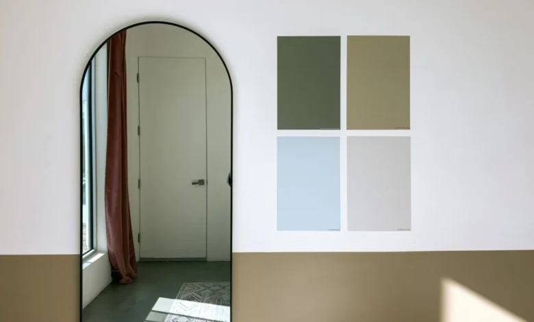
The inaugural Samplize American Paint Color Report provides a groundbreaking look at consumer hesitation, experimentation, and decision-making by analyzing millions of peel-and-stick paint samples ordered across the United States. Spanning the first six months of the years 2024, 2025, and 2026, the data captures consumer behavior across three of the industry’s most influential brands: Benjamin Moore, Farrow & Ball, and Sherwin-Williams. By tracking which colors homeowners test side by side on their walls before committing, the report sheds light on the actual shortlists guiding American interior design.
Decoding the Sampling Stage: A New Metric for Design Trends
Traditionally, market research in the paint industry has relied on point-of-sale data or surveys administered after a project has been completed. While these methods accurately report what was bought, they offer little insight into the paths not taken. Makenna Lutz, partnerships lead at Samplize, emphasizes that analyzing the sampling phase bridges a critical gap in consumer research.
According to Lutz, evaluating the pre-purchase sampling stage illuminates three vital elements of modern home renovation: the full shortlist of colors an individual actually weighed, the specific hues tested against one another in real-world lighting conditions, and the frequency with which these shortlists span multiple competing paint manufacturers.
By capturing this granular phase of the design process, the data reveals a profound structural shift in American aesthetic preferences—one that favors thermal comfort, enveloping moods, and a decisive move away from clinical coolness.
The Thermal Shift: The Meteoric Rise of Warm Tones
The most striking headline emerging from the three-year dataset is the rapid and accelerating dominance of warm color palettes. Over the course of the study, warm colors grew nearly three times faster than their cool counterparts. By the final timeframe evaluated, warm tones accounted for an overwhelming 69.4% of all paint samples ordered through the platform, a notable increase from 64.3% just two years prior.
This thermal polarization is further underscored by the composition of consumer shortlists. Half of all American paint shortlists analyzed contained zero cool colors, a significant jump from 43% at the inception of the study.
Initially, industry observers might be tempted to attribute this warming trend to a predictable cyclical return to soft, pale beiges, stark ivories, and creamy off-whites—a nostalgic nod to the minimalist neutral trends of the early 2000s. However, a deeper dive into the depth and saturation of the samples reveals a far more nuanced psychological and aesthetic evolution among homeowners.
Depth and Drama: Warmth Across the Spectrum
The most unexpected finding of the Samplize report centers on the relationship between color temperature and depth. Conventional interior design wisdom often equates warmth with lightness—expecting homeowners to lean toward airy, sun-washed pastels to brighten their living spaces.
"The genuine surprise was in the split by depth," notes Lutz. "We expected the warming to show up as lightening—it didn’t. Warm outgrew cool at every depth, and the deepest warm tones grew fastest of all, roughly six times faster than deep cool tones."
This dual-track growth demonstrates that Americans are not abandoning dramatic, high-impact interiors; rather, they are altering the emotional temperature of that drama. At one end of the spectrum, delicate, blush-infused plasters and warm creams are experiencing sustained popularity. Notable examples driving this trend include Farrow & Ball’s Setting Plaster, Benjamin Moore’s Proposal, and Sherwin-Williams’ Malted Milk.
Simultaneously, at the opposite end of the spectrum, deep and moody warm tones are surging. Benjamin Moore’s Classic Burgundy—historically one of the darkest and most saturated red-toned hues included in the study—grew at a pace comparable to its lighter counterparts. This indicates that homeowners still desire saturated, cocoon-like spaces, but they prefer the rich, earthy embrace of red and brown undertones over the stark, industrial chill of navy blues or charcoal grays.
The Renaissance of the Brown and Taupe Family
Reinforcing this thermal pivot is the remarkable resurgence of brown shades, which grew faster than any other color family during the study period. Brown hues now appear on 13.4% of all American shortlists, up sharply from 9.2%.
Crucially, however, the catalysts for this growth are not the heavy, saturated chocolates or rustic terra cottas of previous decades. Instead, consumers are gravitating toward complex, muted hybrids that bridge the gap between gray and brown.
The data highlights surging interest in hues such as Sherwin-Williams’ Warm Stone and Urbane Bronze, Farrow & Ball’s London Clay, and Benjamin Moore’s Smokey Taupe. These sophisticated greiges, warm grays, and stone-adjacent neutrals provide the grounding architectural presence of traditional browns while maintaining the airy versatility required for contemporary open-plan living.
Green Establishes Permanent Residency
While warm neutrals and earthy tones dominate the growth metrics, the data also highlights the maturation of green within the American domestic landscape. After experiencing a meteoric rise in preceding years, green has ceased to be a volatile trend and has successfully cemented itself as a staple of the permanent palette.
Today, green shades appear on 34.6% of all consumer shortlists. Rather than skewing toward bright apple or emerald greens, the sampling data shows a steady preference for biophilic, nature-inspired variations. Sage, moss, olive, and deeper botanical greens dominate the shortlists, reflecting a continued consumer desire to foster a tangible connection to the natural world within residential architecture.
Monolithic Palettes and the Psychology of Color Selection
Beyond individual color families, the Samplize report offers fascinating insights into how consumers build their interior design strategies. The data indicates that temperature consistency is rapidly becoming a primary design principle for homeowners.
Two-thirds of all analyzed shortlists contain color options drawn from only one temperature group. Specifically, half of all shortlists are composed entirely of warm shades, while only about a third of consumers actively mix warm and cool tones during their evaluation phase. This suggests that modern renovators are increasingly intentional, seeking cohesive thermal environments rather than eclectic, high-contrast color mixing room-to-room.
Furthermore, there is compelling evidence that the warming palette is expanding its chromatic range. While neutral beiges and greiges form the baseline, smaller color families are experiencing rapid proportional growth from modest starting points. Pink and red have emerged as the fastest-growing color families overall, while the "warm-and-deep" categorization stands out as the fastest-growing combination of temperature and depth in the entire dataset.
Broader Implications for the Design Industry
While three years of peel-and-stick sampling data cannot definitively forecast the exact aesthetic profile of American walls a decade from now, the findings carry significant weight for manufacturers, retailers, and design professionals alike.
The data proves that contemporary homeowners are more deliberate, experimental, and nuanced than traditional mass-market forecasting often suggests. The ongoing retreat from cool grays and stark whites is not merely a passing fad, but a sweeping recalibration toward spaces that prioritize psychological comfort, organic warmth, and tactile richness.
Whether through the soft embrace of a blush plaster, the understated elegance of a stone-toned taupe, or the dramatic luxury of a deep burgundy, Americans are systematically rewriting the rules of modern interior color—one sample at a time.