The Art of Rebellion: How Good Secrets Crafted the Visual Identity for HBO Originals U.S. Against the World

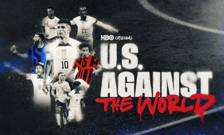
The intersection of sports documentary filmmaking and avant-garde graphic design has reached a new pinnacle with the release of HBO Originals’ latest sports feature, U.S. Against the World. To capture the tumultuous, gritty, and fiercely ambitious journey of the United States Men’s National Soccer Team (USMNT), creative studio Good Secrets was tasked with developing a bespoke visual identity. Rejecting slick, corporate digital aesthetics in favor of a visceral, handcrafted approach, the studio devised a mixed-media design language that marries the rhythmic cadence of hip-hop with the raw, anti-establishment energy of punk rock.
The resulting title sequence and comprehensive graphics package serve as much more than mere transitional elements; they function as narrative artifacts. Utilizing physical artistic techniques—including distressed film stocks, mixed-media collage, and authentic graffiti—Good Secrets successfully translated the psychological and physical wear-and-tear of elite athletic competition into a tangible visual vocabulary.
The Genesis of a Gritty Aesthetic
When conceptualizing the visual landscape for U.S. Against the World, the creative team at Good Secrets—led by Casey Latiolais and Preston Gibson, alongside producer Ryan Shoe—faced a unique challenge. The USMNT narrative is rarely straightforward. It is a story marked by underdog mentalities, cyclical revitalization, intense public scrutiny, and a relentless drive to carve out a respected space on the global football stage. To mirror this complex socio-athletic reality, the studio established a clear stylistic formula: seventy percent hip-hop culture and thirty percent punk rock ethos.
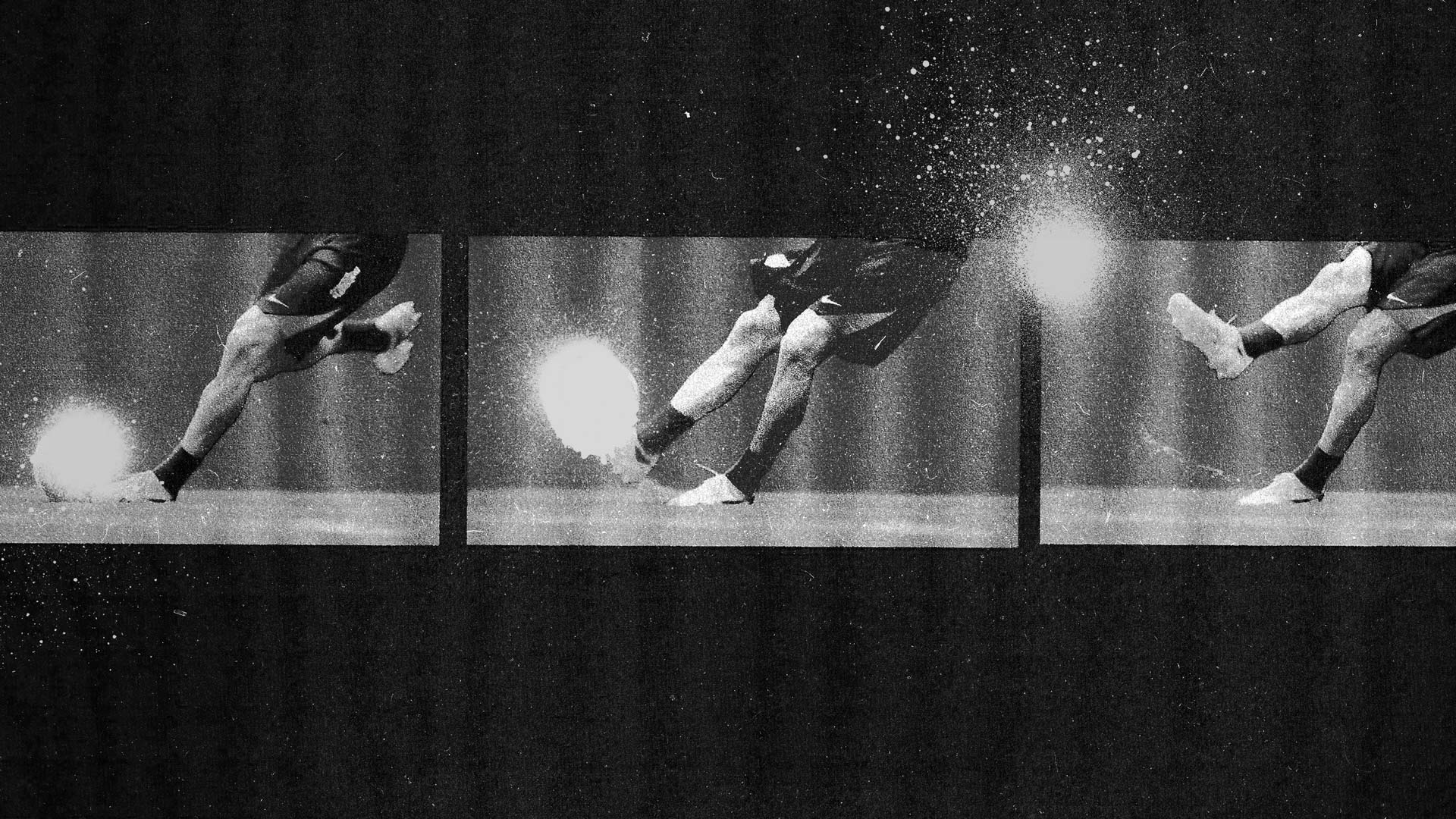
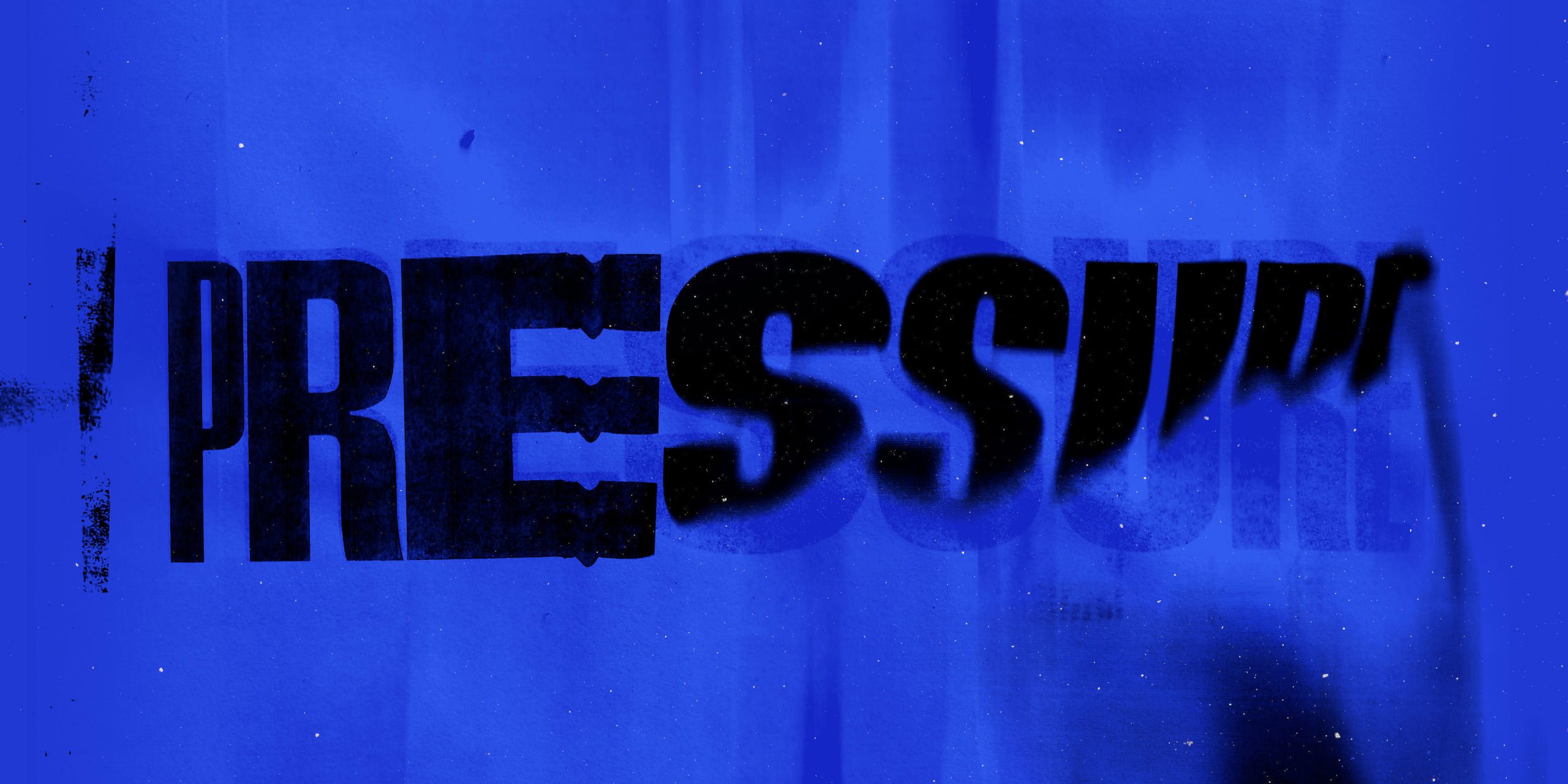
This philosophy manifested in every frame of the production. Rather than relying solely on clean vector graphics or standard computer-generated imagery (CGI), the team leaned heavily into tactile, analogue processes. Scratched celluloid film, layered paper collages, and dynamic spray-paint splatters were integrated directly into the framing. According to the studio, this tactile approach was necessary to punctuate the team’s presence with a visual language rugged enough to keep pace with their trajectory.
While the primary title sequence stands as the centerpiece of the design work, the stylistic DNA was methodically woven throughout the entire broadcast and streaming package. Every on-screen element—from data callouts and bespoke geographical maps to game clocks, scorecards, and historical archival footage treatments—adhered to the same rebellious design guidelines.
A Collaborative Marathon
Bringing U.S. Against the World to the screen was no small undertaking. The project represented a year-long marathon of rigorous, high-level collaboration between multiple production entities. Good Secrets worked in close alignment with series creators Rand Getlin and Janina Pelayo of Park Stories, as well as Outpost Creative Director Lucas Harger.
The partnership demanded an exhaustive commitment to detail. Animators and designers Mike Russo and Preston Gibson spent months refining the balance between chaotic artistic expression and legible broadcast information. Every spray-paint splatter, torn edge, and flickering frame was meticulously placed to ensure it contributed directly to the thematic undercurrents of the narrative. This dedication to craft was described by the studio team as being driven by an unwavering standard of excellence and an uncompromised passion for the material.
Background Context and Narrative Significance
The release of U.S. Against the World arrives at a pivotal juncture for soccer in the United States. As the nation prepares to co-host the upcoming FIFA World Cup alongside Canada and Mexico, public interest in the mechanics, culture, and history of the USMNT has reached unprecedented heights. Documentaries focusing on the program carry immense weight, serving not only as entertainment for die-hard supporters but also as cultural primers for casual observers discovering the sport ahead of the tournament.
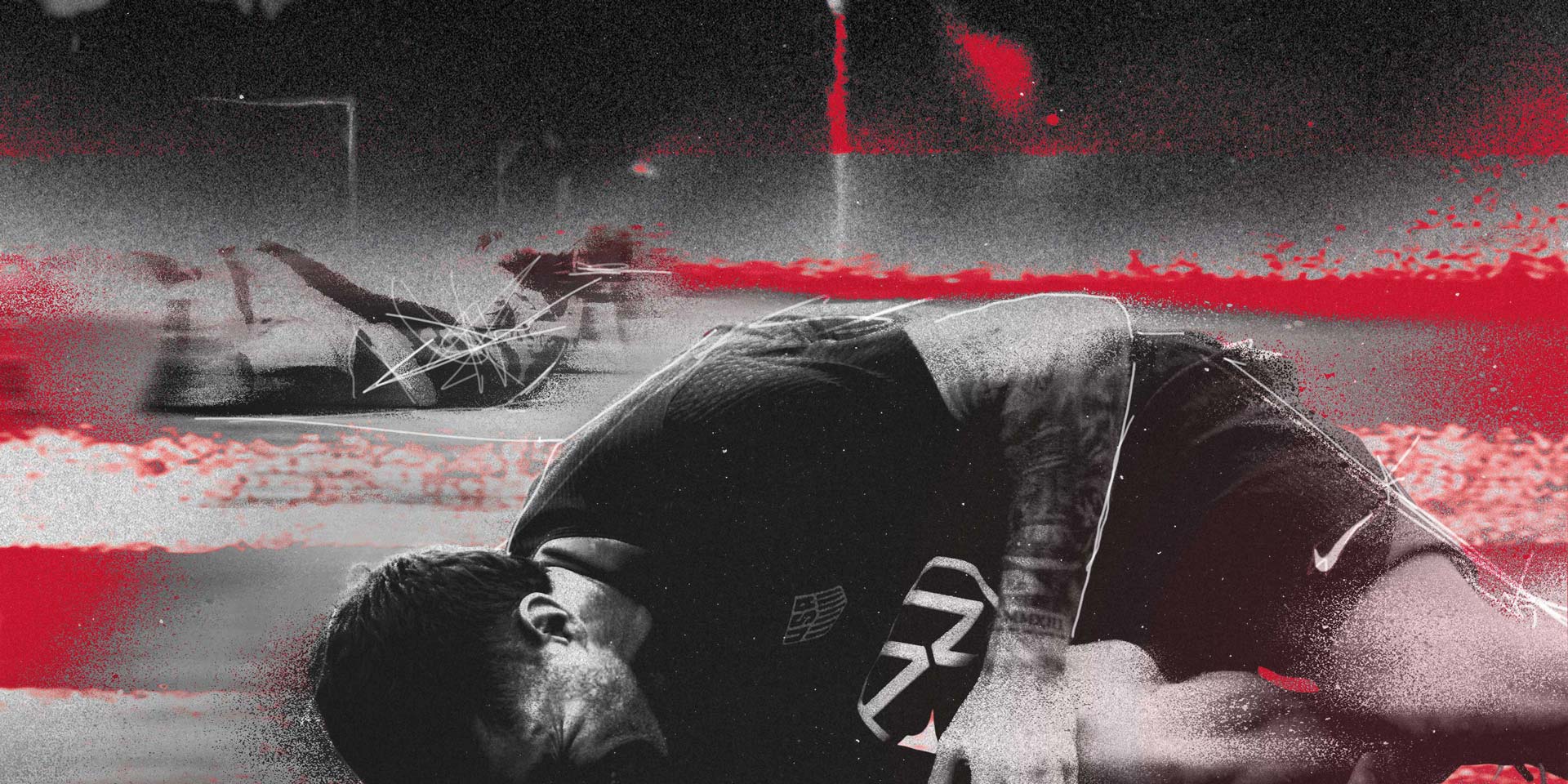
Historically, sports documentaries produced for major streaming platforms and premium cable networks like HBO have relied on familiar tropes: soaring orchestral scores, pristine slow-motion footage, and authoritative voiceover narration. By subverting these conventions through a punk-inspired, hip-hop-inflected design language, U.S. Against the World sets a new benchmark for how athletic grit is visually articulated. The stylistic choices mirror the modern player demographic—young, diverse, culturally integrated, and unapologetically ambitious.
Chronology of Production and Creative Execution
The development of the U.S. Against the World graphics package followed a structured, multi-phase timeline typical of high-end broadcast design, executed over an intensive twelve-month period:
- Phase One: Conceptualization and R&D (Months 1–3): Initial brainstorming sessions between Good Secrets, Park Stories creators Rand Getlin and Janina Pelayo, and Outpost Creative Director Lucas Harger. Mood boards were established, cementing the "70% hip-hop, 30% punk rock" framework and defining the tactile, analogue aesthetic.
- Phase Two: Asset Generation and Physical Testing (Months 4–7): The studio moved away from digital-only creation to experiment with physical mediums. Artists physically scratched film reels, generated spray-paint textures, and constructed mixed-media paper collages to capture authentic grit.
- Phase Three: Title Sequence Assembly (Months 8–10): Animation and design leads Preston Gibson and Mike Russo integrated the physical elements into digital pipelines, cutting together the primary title sequence—the narrative anchor of the project.
- Phase Four: Package Expansion and Delivery (Months 11–12): The core visual ethos was scaled across the entire documentary ecosystem. Custom maps, scorecards, game clocks, and archival treatments were finalized and delivered to HBO Originals ahead of the premiere.
Industry Implications and Aesthetic Shift
The reception of the visual package for U.S. Against the World highlights a broader trend within motion design and sports broadcasting: the demand for authenticity and tactile imperfection. In an era dominated by hyper-polished, synthetic digital interfaces, audiences increasingly resonate with work that feels human, flawed, and handcrafted.
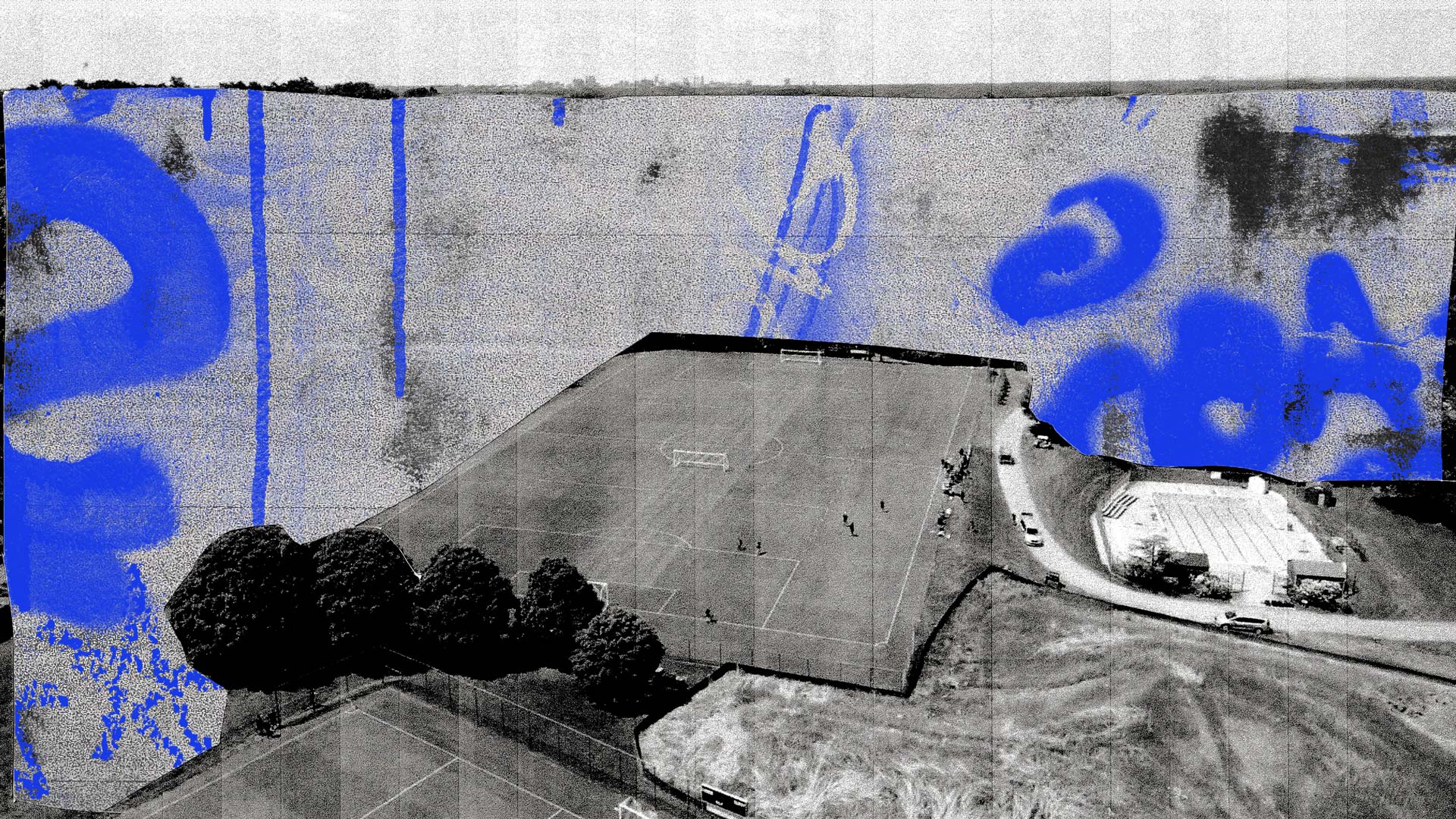
By grounding the USMNT’s story in the raw textures of film scratches and graffiti, Good Secrets has demonstrated that sports branding can transcend traditional corporate aesthetics. The design choices do not merely decorate the screen; they actively participate in storytelling, contextualizing the sweat, struggle, and defiance inherent to elite athletic competition.
As HBO Originals continues to expand its catalog of high-impact sports storytelling, the visual framework established by Good Secrets, Park Stories, and Outpost provides a compelling blueprint for future projects. It proves that when graphic design matches the true grit of its subject matter, the results leave a lasting impression long after the final whistle blows.
Production Credits Overview
- Client: HBO Originals
- Series Creators: Rand Getlin & Janina Pelayo (Park Stories)
- Creative Director: Lucas Harger (Outpost)
- Design Studio: Good Secrets
- Creative Direction: Casey Latiolais & Preston Gibson
- Producer: Ryan Shoe
- Animation & Design: Mike Russo & Preston Gibson
Related posts: