Despite broad browser support, CSS container queries remain a largely underutilized tool in the modern web developer’s arsenal, often misunderstood as a direct replacement for traditional media queries. While media queries have served as the bedrock of responsive design since the inception of the mobile web, the industry is currently shifting toward a more granular, component-driven architecture. This transition is marked by the adoption of container queries, a feature designed to allow individual UI elements to respond to their immediate parent containers rather than the global viewport, yet adoption remains unexpectedly sluggish despite clear technical advantages.
The Evolution of Responsive Design
The history of responsive web design is intrinsically linked to the 2010 introduction of media queries by Ethan Marcotte. At the time, the challenge was simple: how to make a webpage look acceptable on both a desktop monitor and the burgeoning smartphone market. Media queries answered this by allowing developers to set breakpoints based on the width of the browser window. For over a decade, this has been the industry standard.
However, as design systems and component-based frameworks—such as React, Vue, and Svelte—became the standard for front-end development, the limitations of the viewport-based approach became increasingly apparent. A "card" component designed for a 12-column grid might look perfect on a full-width desktop layout but break entirely when placed in a sidebar or a narrow widget area. Despite the viewport remaining the same size (e.g., 1920px), the card’s internal environment has fundamentally changed. This "component-reusability" crisis has been a central point of contention in CSS development circles for years, leading to the eventual specification and implementation of container queries.

Current Adoption and Technical Disparity
Data from the 2025 State of CSS survey indicates a significant gap between awareness and implementation. While 86% of professional web developers report being familiar with container queries, fewer than 42% have integrated them into production environments. This lag is particularly striking given that the feature currently boasts approximately 94% global browser support.
At the SmashingConf Amsterdam 2026, industry experts and educators, including Kevin Powell, highlighted this disparity as a critical bottleneck in web performance and design consistency. The reluctance to adopt the technology is largely attributed to the initial learning curve and the superficial visual similarity between @media and @container syntax. Developers often mistakenly assume that since the syntax is similar, the functional logic is identical, leading to early implementation failures that discourage further use.
The Technical Divide: Viewport vs. Context
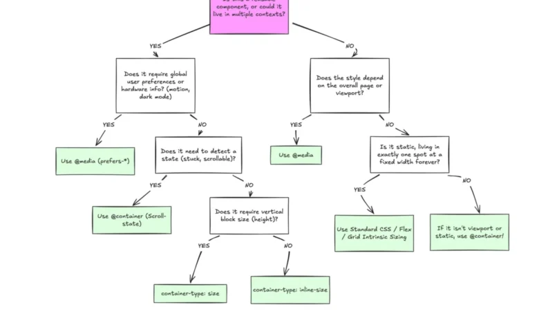
The fundamental difference between the two technologies lies in the frame of reference. Media queries are "outward-looking"; they query the browser’s viewport. This is a "macro" approach to layout, best suited for overall page structure, such as changing a grid from one column to three as the screen widens.
In contrast, container queries are "inward-looking." They allow a developer to define an element as a container, enabling its descendants to query that specific wrapper’s dimensions. This "micro-layout" approach ensures that a component is truly encapsulated. If a card is placed in a 300px wide sidebar, it will trigger its "mobile" layout styles regardless of whether the user is browsing on a 400px wide phone or a 4K monitor.

The move away from the viewport as the primary source of truth for responsive styling is a major paradigm shift. With over 2,300 unique viewport sizes currently in circulation across the fragmented device market, relying on media query breakpoints to predict component behavior is statistically unreliable. Container queries provide a deterministic way to handle layout, ensuring that components behave based on the space they occupy rather than the device they are viewed on.
Practical Applications and Fluid Typography
The benefits of this shift are most evident in fluid typography and internal component state management. Previously, developers used vw units to scale text, which was inherently tethered to the browser width. This led to text becoming unreadably small or excessively large depending on the context of the container. By utilizing container-relative units like cqi (container query inline-size) combined with the clamp() function, developers can now ensure that typography scales proportionally to the component’s container.
Furthermore, container queries offer a workaround for the long-standing limitation of Flexbox and CSS Grid: the inability to detect internal layout states. While CSS cannot natively detect if a flex item has wrapped to a new line, container queries can monitor the inline size of the container. When the container reaches a specific threshold where items wrap, the query triggers, allowing for dynamic re-styling of the component. This effectively mimics event-driven design that previously required heavy JavaScript-based ResizeObserver implementations.
Implementation Challenges and Best Practices
While powerful, container queries are not without their complexities. A common pitfall is the attempt to query a container against itself. Because a container cannot calculate its own size based on styles it simultaneously applies (which would create an infinite loop), developers must wrap their components in a parent container to establish the proper hierarchy.

Additionally, querying the block (vertical) size of a container can lead to layout collapse. If a container is set to container-type: size without an explicit height, the browser renders it at 0px, effectively hiding the content. Best practices dictate a preference for container-type: inline-size for the majority of responsive tasks, reserving block-size queries only for specialized vertical layouts.
Finally, the inability to use custom properties (CSS variables) directly within a container query condition—due to the potential for circular dependencies—remains a hurdle. Developers must currently hard-code values within the query, a trade-off made for the sake of rendering stability.
The Future of Component-Driven Design
The industry is currently in a transitional phase where the "macro" (viewport) and "micro" (component) approaches must coexist. Media queries remain essential for high-level site structure, such as header positioning and overall site navigation. However, the architectural move toward component-based design demands that layout logic be embedded within the components themselves.
The failure to widely adopt container queries represents a missed opportunity to reduce technical debt and simplify CSS codebases. By decoupling a component’s appearance from the page’s global constraints, developers can build more robust, modular, and maintainable interfaces. As the web continues to fragment across an ever-growing array of device sizes—from smartwatches to ultra-wide desktop displays—the necessity of context-aware styling will only increase. The transition from viewport-reliant media queries to container-based logic is not merely a stylistic preference; it is a fundamental requirement for the next generation of scalable web development.