Decoding the American Palette: What Millions of Paint Samples Reveal About Our Changing Homes

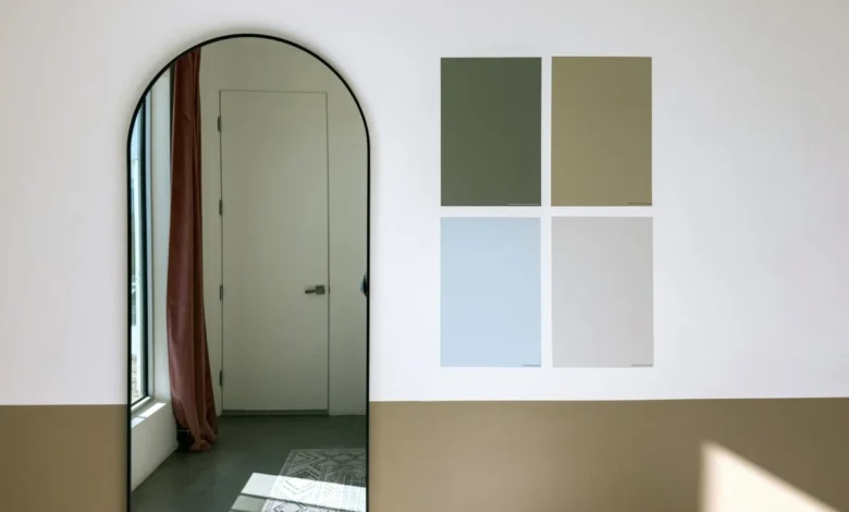
For decades, the trajectory of residential interior design has been dictated from the top down. Paint manufacturers, color forecasters, and high-profile designers regularly convene to crown a singular Color of the Year, unveiling meticulously curated palettes meant to define the aesthetic zeitgeist of the coming months. Yet, these well-publicized declarations often capture aspirations rather than realities—reflecting what people say they like, what looks striking in a glossy magazine spread, or what eventually clears inventory shelves. A distinct disconnect has long existed between the theoretical color trends predicted by industry experts and the hesitant, deliberate choices homeowners make when standing in a hardware store aisle, paint brush in hand.
To bridge this gap and uncover the true mechanics of domestic design choices, a new empirical approach has emerged. The inaugural Samplize American Paint Color Report offers an unprecedented look into the decision-making process by analyzing millions of paint samples ordered across the United States during the first six months of the years 2024, 2025, and 2026. Rather than relying on sales receipts of finished gallons—which only confirm a final choice—this comprehensive dataset tracks the exploratory phase: the peel-and-stick paint samples homeowners ordered, evaluated side by side, and ultimately weighed against one another before committing to a project. By aggregating data across major industry heavyweights such as Benjamin Moore, Farrow & Ball, and Sherwin-Williams, the report unveils a remarkably accurate mirror of changing American tastes.
Understanding the Sampling Stage: A Window Into Consumer Intent
The methodology behind the report centers on a crucial phase of interior renovation that has historically eluded market researchers. Makenna Lutz, partnerships lead at Samplize, emphasizes that examining the sampling stage provides granular insights that traditional point-of-sale data simply cannot capture. According to Lutz, analyzing this phase reveals three fundamental dimensions of home design: the full shortlist of colors a person actually considered, the specific hues tested against one another in real-world lighting conditions, and how those shortlists successfully transcend individual brand ecosystems.
When consumers order samples from multiple brands simultaneously, they are engaging in a rigorous comparative analysis. They are testing how a Farrow & Ball neutral looks directly beneath a Sherwin-Williams accent or how a Benjamin Moore dark tone behaves against natural morning light compared to evening artificial illumination. This behavior demonstrates that modern homeowners are increasingly methodical, approaching interior color selection not as an impulsive purchase, but as a carefully calculated investment in their living environments. The data gathered from millions of these micro-decisions over a three-year timeline provides a panoramic view of an aesthetic shift that is both sweeping and subtle.
The Ascendancy of Warm Tones Across the American Household
The most striking macro-trend documented in the Samplize report is the definitive retreat of cool aesthetics and the corresponding dominance of warm color palettes. Over the monitored three-year period, warm colors experienced a growth rate nearly three times faster than their cool counterparts. By the conclusion of the data collection window, warm tones accounted for an overwhelming 69.4% of all colors tested on the platform, climbing significantly from the 64.3% baseline recorded two years prior.
This warmth is not merely sneaking into secondary rooms or guest bedrooms; it is actively displacing cool palettes entirely from the decision-making process. The data reveals that half of all American color shortlists now contain zero cool colors—a notable increase from the 43% recorded at the onset of the study. The modern American home is shedding the clinical grays and icy blues that dominated the 2010s, replacing them with environments designed to evoke comfort, intimacy, and tactile groundedness.
Depth and Temperature: Challenging the All-Beige Assumption
A superficial reading of this data might lead interior design analysts to conclude that the market is simply experiencing another predictable swing back toward pale beiges, soft ivories, and nondescript creams. However, a deeper examination of the metrics dispels this notion, revealing a landscape defined by nuance rather than monotony.
"The genuine surprise was in the split by depth," Lutz notes, highlighting a counterintuitive finding within the research. Industry observers initially hypothesized that the collective warming of interior preferences would manifest primarily as a lightening of spaces—a widespread shift toward airy, sun-washed pastels. Instead, the data proved otherwise. Warm colors outgrew cool colors across every conceivable depth category. Most notably, the deepest warm tones experienced the most dramatic surge, growing at a velocity roughly six times faster than deep cool tones.
This phenomenon illustrates that homeowners have not abandoned their appetite for dramatic, high-impact interiors. Rather, the emotional temperature of that drama has shifted. At the lighter end of the spectrum, the market has embraced blush-toned plasters and warm creams, exemplified by products like Farrow & Ball’s Setting Plaster, Benjamin Moore’s Proposal, and Sherwin-Williams’ Malted Milk. Simultaneously, at the opposite end of the depth spectrum, shades like Benjamin Moore’s Classic Burgundy—historically one of the darkest and most saturated offerings included in the study—have maintained a rapid pace of growth. The desire for cocoon-like, moody spaces remains intact, but those spaces are increasingly anchored in red-based and warm-undertoned pigments rather than charcoal grays and midnight blues.
The Evolution of Neutrals: The Rise of Muted Greiges and Stone Tones
Nowhere is this temperature shift more apparent than in the evolution of brown and neutral color families. Brown shades have surged faster than any other color category within the dataset, now appearing in 13.4% of all shortlists, up substantially from 9.2%.
Crucially, however, the specific shades driving this expansion are not the saturated chocolates, mahoganies, or bright terracottas of previous decades. Instead, the market is favoring complex, highly muted hybrids. Products such as Sherwin-Williams’ Warm Stone and Urbane Bronze, Farrow & Ball’s London Clay, and Benjamin Moore’s Smokey Taupe are leading the charge. These colors occupy a sophisticated middle ground—greiges, warm grays, and weathered stone-like shades that offer the versatility of a traditional neutral while radiating an underlying warmth that completely alters the spatial mood of a room.
This embrace of stone and earth-adjacent neutrals points to a broader cultural desire for permanence and natural connection within the built environment. As urban living spaces become more digitized and fast-paced, residential interiors are increasingly utilized as therapeutic counterweights, featuring materials and palettes that mimic the organic stability of the natural world.
Green Establishes Permanent Residency in the Modern Palette
While warm neutrals and deep burgundies represent shifting dynamics, the trajectory of green illustrates a different phenomenon: maturation and stabilization. In the years immediately following pandemic-era home renovation booms, green experienced an unprecedented spike in popularity, transitioning rapidly from an accent color to a dominant neutral across kitchens, cabinetry, and living areas.
According to the Samplize report, green has officially ceased to be a volatile trend and has instead settled comfortably into the permanent American palette. Today, green appears in 34.6% of all consumer shortlists. Rather than leaning toward a single shade, this sustained popularity spans a broad spectrum of botanical inspirations—ranging from muted sage and eucalyptus to deep, forest-derived moss tones. The ubiquity of green across nearly a third of all shortlists suggests that it is now viewed by homeowners as a timeless baseline choice, operating much like navy blue or charcoal did in previous generations.
Behavioral Patterns: The Psychology of the Single-Temperature Room
Beyond tracking individual colors and families, the report sheds light on the psychological behavior of the modern renovator. An analysis of how samples are combined on shortlists reveals a striking rigidity regarding color temperature: two-thirds of all analyzed shortlists contain colors drawn from exclusively one temperature group.
Specifically, half of all shortlists are entirely warm, while only about a third attempt to intentionally mix warm and cool shades within the same project. This binary approach suggests that homeowners are becoming increasingly decisive about the emotional atmosphere they wish to cultivate. Rather than attempting complex balancing acts between opposing temperatures, consumers are leaning into cohesive, unified environments where the overarching tone is established early and maintained rigorously throughout the design scheme.
Furthermore, signs indicate that the warming palette is growing progressively more vibrant. While neutrals and earth tones form the backbone of the data, color families starting from smaller baseline percentages—most notably pinks and reds—are demonstrating the fastest growth trajectories. The combination of warm undertones and deep saturation represents the single fastest-growing intersection of temperature and depth in the entire dataset.
Implications for the Future of Residential Design
It would be premature to declare that deep burgundy is poised to replace beige as the universal background of American walls, nor can three years of sample tracking definitively predict the long-term architectural aesthetic of the decade. Design trends are inherently cyclical, influenced by macroeconomic factors, cultural shifts, and technological developments.
Nevertheless, the data captured in the first Samplize American Paint Color Report challenges long-held assumptions about how domestic spaces evolve. The shift observed across millions of households is not merely a superficial movement toward lighter or quieter rooms. From soft, tactile plaster pinks and weathered stone browns to rich, enveloping reds, American homeowners are actively exploring the full spectrum of warmth. In doing so, they are rewriting the rules of interior aesthetics from the bottom up—proving that the true narrative of design is written not by forecasting agencies, but by the quiet, deliberate choices made in millions of homes before a single drop of paint ever touches a wall.