
Cal Sans UI A New Open Source Variable Typeface Revolutionizes Interface Design with Dynamic Geometric and Humanist Axis
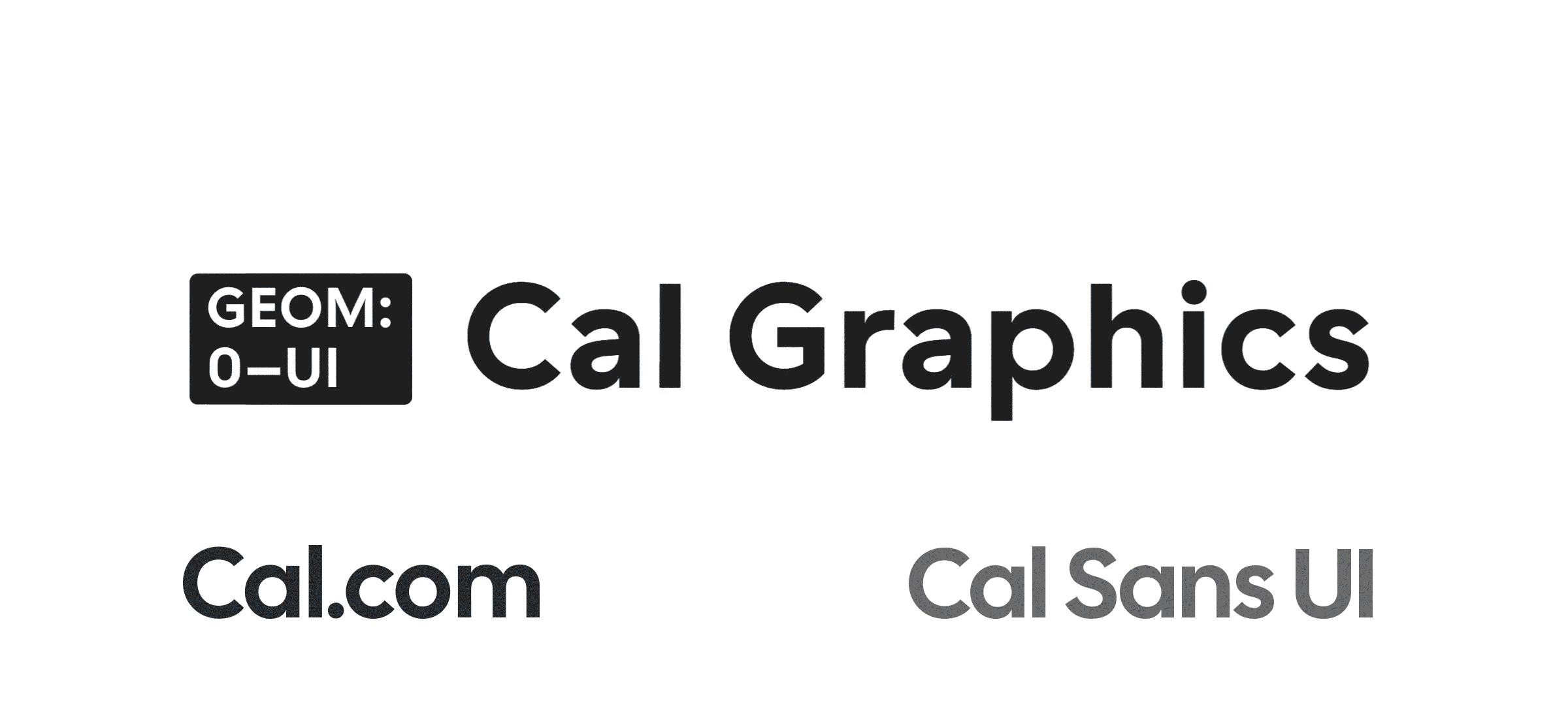
Cal.com, the prominent open-source scheduling infrastructure platform, has officially announced the release of Cal Sans UI, a sophisticated variable typeface designed to bridge the gap between expressive brand identity and high-performance user interface requirements. Developed by renowned typographer Mark Davis through his practice, WORDMARK, the typeface represents a significant contribution to the open-source design community. Unlike traditional static fonts, Cal Sans UI introduces a specialized "GEOM" axis, allowing designers to modulate letterforms between organic humanist curves and rigid geometric proportions. This release comes as Cal.com continues to expand its influence in the developer ecosystem, leveraging its community of over 50,000 GitHub stars to promote a new standard for interface typography.
The typeface is released under the SIL Open Font License (OFL), ensuring it remains free for both personal and commercial use without the restrictive licensing fees often associated with high-end variable fonts. By providing a tool that is both technically robust and aesthetically flexible, Cal.com and Mark Davis aim to provide developers and designers with a versatile alternative to ubiquitous system fonts like Inter, Roboto, and San Francisco.
The Evolution of Cal Sans UI and the GEOM Axis
The development of Cal Sans UI was driven by a specific need within the Cal.com ecosystem: a typeface that could maintain legibility at small sizes while offering a distinct personality for marketing and brand-focused applications. Mark Davis, whose work frequently explores the boundaries of variable font technology, conceptualized the GEOM axis as a solution to the "geometric vs. humanist" dilemma that often plagues UI design.
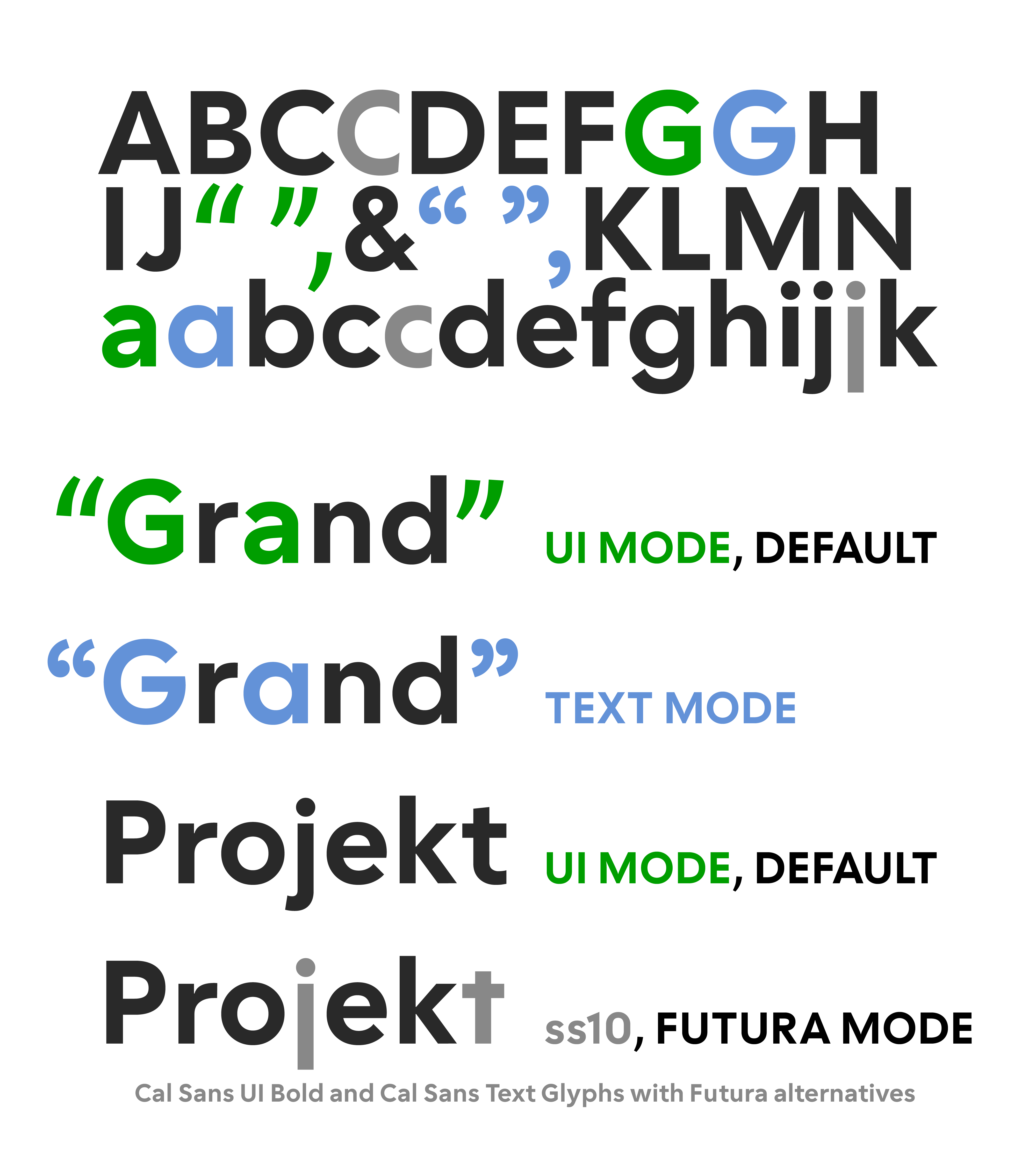
In typography, "humanist" forms are characterized by their roots in calligraphy and organic movement, offering higher legibility and a softer, more approachable feel. Conversely, "geometric" forms are built on mathematical shapes—perfect circles, squares, and triangles—providing a modern, clean, and often architectural aesthetic. Cal Sans UI allows users to navigate these two poles on a continuous scale from 0 to 100. At the 0 setting, the typeface exhibits humanist characteristics, making it ideal for long-form reading and data-heavy interfaces. As the slider moves toward 100, the characters transform into strict geometric shapes, suitable for bold headlines and high-impact branding.

This fluidity is made possible by OpenType Variable Font technology, which stores multiple font styles within a single file. This not only reduces the overall file size for web performance but also gives developers granular control over typography via CSS, enabling dynamic shifts in font character based on user interaction or screen context.
Technical Specifications and Rendering Optimization
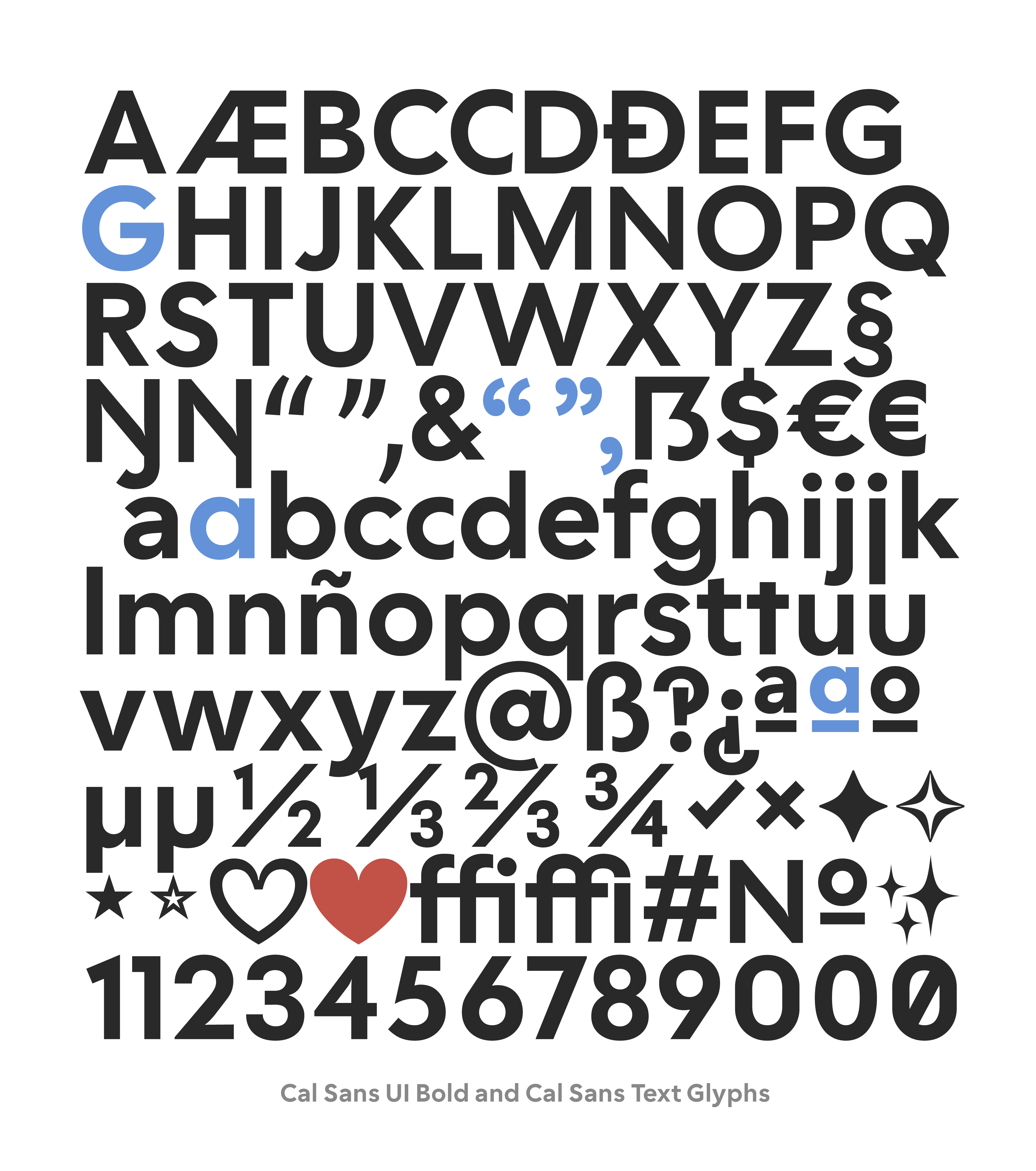
Cal Sans UI is not merely a stylistic exercise; it is a precision-engineered tool built for modern screen environments. The family is divided into three distinct sub-families to address different use cases: Cal Sans UI, Cal Sans UI Text, and Cal Sans UI Geo. Each of these families supports a weight axis ranging from Light to Bold, ensuring a full typographic hierarchy can be established within a single system.
One of the most critical aspects of the typeface’s design is its optimization for 14–15px rendering. In interface design, these sizes are the standard for body text, labels, and navigation elements. To ensure maximum clarity on high-density (Retina and 4K) screens, Davis focused on maintaining generous x-heights and open counters. Furthermore, the vertical metrics of Cal Sans UI have been meticulously aligned with industry standards such as Inter, Geist, and Roboto. This technical decision is significant for developers, as it allows Cal Sans UI to be dropped into existing codebases as a "drop-in replacement." Because the line heights and bounding boxes match these common fonts, switching to Cal Sans UI requires no manual adjustments to padding, margins, or layout alignments.
The typeface’s linguistic reach is equally impressive, supporting more than 100 languages. This extensive glyph coverage ensures that global platforms can maintain a consistent brand voice across different regions without resorting to fallback system fonts that might disrupt the visual experience.
Strategic Background: Cal.com and the Open Source Movement
The commissioning of Cal Sans UI by Cal.com reflects a broader trend in the technology sector where open-source companies invest heavily in custom typography to differentiate themselves in a crowded market. Cal.com has positioned itself as the "open-source Calendly," prioritizing transparency, customization, and developer-first features. With over 50,000 stars on GitHub, the platform has become a central hub for collaborative scheduling software.
By releasing Cal Sans UI under the SIL Open Font License, Cal.com is following in the footsteps of companies like Google and Adobe, which have historically supported the development of high-quality free fonts to improve the overall quality of the web. However, Cal Sans UI differs by offering a level of "expressive range" that is rarely found in free UI fonts. Most open-source fonts are designed to be "invisible"—functional and neutral. Cal Sans UI, through its GEOM axis, allows for a level of stylistic play that was previously the exclusive domain of expensive, proprietary type foundries.
Industry Reception and Availability
The design community has responded with significant interest to the release. Creative Boom, a leading art and design publication, recognized Cal Sans UI as one of the best new typefaces of April 2026, citing its innovative use of variable axes and its utility in digital product design. The typeface has already begun to see adoption among early-adopter designers who frequent platforms like Figma and GitHub.
For ease of integration, the typeface is available through several channels. Developers can install it via npm using the package @calcom/cal-sans-ui, while the source files and documentation are hosted on GitHub at the calcom/sans-ui repository. To assist designers in visualizing the font’s capabilities, Cal.com has launched an interactive specimen microsite at cal.com/font. This site features a live "playground" where users can manipulate the GEOM and weight axes in real-time, observing how the letterforms transition from organic to geometric states.
While currently available for manual installation and via package managers, Cal.com has confirmed that submissions to Google Fonts and Adobe Fonts are currently pending. Once approved, these additions will further lower the barrier to entry, allowing the typeface to be served via global Content Delivery Networks (CDNs) with a single line of code.
Chronology of Development
The journey of Cal Sans UI began in mid-2024, when Cal.com identified a need for a more cohesive visual identity that could scale from their web application to their marketing materials.
- Late 2024: Mark Davis of WORDMARK was commissioned to explore a variable font solution that could handle both "UI" and "Brand" duties.
- 2025: The "GEOM" axis concept was refined through multiple iterations, testing legibility at small sizes against the aesthetic requirements of large-scale display use.
- Early 2026: Beta versions were tested within the Cal.com internal dashboard, ensuring compatibility with various browsers and operating systems.
- April 2026: The final version was released to the public under the OFL, accompanied by the interactive microsite and npm package release.
Analysis of Implications for UI/UX Design
The release of Cal Sans UI signals a shift in how designers approach "System UI" aesthetics. For the past decade, the industry has leaned heavily toward "Neo-Grotesque" fonts—neutral, sans-serif faces that prioritize legibility above all else. While effective, this has led to a "homogenization" of web design, where many SaaS platforms look nearly identical.
Cal Sans UI challenges this status quo by suggesting that a font can be both a workhorse and a centerpiece. The ability to "dial in" the geometricity of a font allows a brand to be "Humanist" (friendly, trustworthy) in its customer support sections and "Geometric" (precise, tech-forward) on its landing pages, all while using the same font file. This reduces cognitive load for the user, as the underlying skeletal structure of the letters remains consistent, providing a subtle sense of continuity across different parts of a digital product.
Furthermore, the alignment with Inter and Roboto metrics addresses one of the primary pain points in web development: reflow. When a font is swapped, it often causes text to wrap differently, breaking layouts. By matching the metrics of the world’s most popular UI fonts, Cal Sans UI removes the "risk" associated with typographic changes, making it an attractive option for large-scale enterprise migrations.
As variable font support becomes universal across all modern browsers, the introduction of specialized axes like GEOM is likely to become more common. Cal Sans UI stands as a pioneering example of how technical constraints can be turned into creative opportunities, providing the global design community with a high-caliber tool that costs nothing but offers immense value. With its pending arrival on major font hosting platforms, Cal Sans UI is poised to become a staple in the toolkit of the modern UI designer.


