
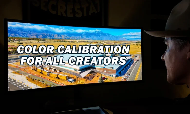
Vashi Nedomansky, ACE, a highly respected figure in the post-production industry, has launched a comprehensive three-part video series titled "My Color Calibration for All Creators." This initiative aims to demystify the often-complex process of monitor color calibration, presenting it as an indispensable step for professionals and aspiring creators across all disciplines, from filmmaking and photography to graphic design and web development. The series underscores the critical importance of color accuracy and consistency in contemporary digital workflows, positioning proper calibration not merely as a technical chore but as a fundamental pillar of creative integrity and professional output.
The Indispensable Role of Color Accuracy in Creative Workflows
In an increasingly visual world, where content is consumed across a multitude of devices and platforms, the precise reproduction of color has become paramount. Inaccurate color representation can lead to a cascade of issues, from client dissatisfaction and costly revisions to compromised artistic intent and brand inconsistency. Nedomansky’s series highlights four compelling reasons why monitor color calibration is not just beneficial but essential for any serious creator. These reasons revolve around ensuring visual fidelity, maintaining professional standards, optimizing creative decision-making, and guaranteeing consistent output across different viewing environments.
For filmmakers and video editors, color accuracy directly impacts the emotional resonance and narrative coherence of their work. A subtle shift in skin tones or environmental hues can drastically alter a scene’s mood. In photography, the difference between a captivating image and a mediocre one often lies in the precise rendition of light and shadow, which is inextricably linked to color. Graphic designers rely on accurate color to ensure brand guidelines are met and printed materials match digital proofs. Web developers and UI/UX designers must ensure that their interfaces appear as intended across diverse user screens. Without a calibrated monitor, creators are effectively working blind, making critical decisions based on an unreliable visual foundation. The series posits that consistency in color is not merely a technical specification but a cornerstone of professional credibility and artistic control.
Vashi Nedomansky’s Expertise and the Genesis of the Series
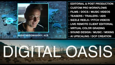
Vashi Nedomansky, an accomplished editor with an impressive portfolio spanning feature films, documentaries, commercials, and music videos, brings a wealth of practical experience to this educational endeavor. His Accredited Editor (ACE) status signifies a high level of proficiency and recognition within the industry, lending significant weight to his recommendations. Nedomansky’s daily workflow demands absolute precision, making him uniquely qualified to guide creators through the intricacies of color management.
The impetus behind "My Color Calibration for All Creators" stems from the persistent challenges faced by professionals in achieving repeatable and reliable color representation. Despite advancements in display technology, the inherent variability between monitors, even from the same manufacturer, necessitates a standardized calibration process. Nedomansky recognized a gap in accessible, practical resources that demystify this critical aspect of post-production. The series is a direct response to the industry’s need for clear, actionable guidance on a topic that, while technical, has profound creative implications. By sharing his methods and insights, Nedomansky aims to empower a broader audience of creators to elevate the quality and consistency of their work.
A Deep Dive into Display Technology: The Dell U4025QW UltraSharp
A significant component of Nedomansky’s series involves showcasing the tools that facilitate professional color management. Central to his current setup is the Dell U4025QW UltraSharp 40-inch monitor, which he describes as a transformative addition to his workflow. This monitor, with its impressive specifications, serves as a practical example of how advanced display technology supports rigorous color-critical tasks.
The Dell U4025QW boasts a 5K resolution, providing an expansive workspace and exceptional detail crucial for editing high-resolution media. Its 40-inch ultrawide, curved profile offers an immersive viewing experience, reducing the need for multiple monitors and streamlining the visual pipeline. The curved design is particularly beneficial for ultrawide displays, as it helps maintain a consistent viewing distance to all parts of the screen, minimizing color and brightness shifts often observed at the edges of large flat panels.
Crucially for color-critical work, the Dell U4025QW offers 100% color space coverage. While the article doesn’t specify which color spaces, high-end professional monitors typically cover 100% sRGB, a high percentage of DCI-P3 (often 98% or more), and a significant portion of Adobe RGB. This extensive color gamut ensures that a wide spectrum of colors can be accurately displayed, accommodating the diverse requirements of different creative projects, from web design (sRGB) to digital cinema (DCI-P3) and print preparation (Adobe RGB). Nedomansky emphasizes that this monitor has replaced several older units in his setup, not only consolidating his workspace but also "future-proofing" his pipeline against evolving industry standards and higher resolution content demands. The integration of such a high-performance monitor underscores the series’ emphasis on utilizing appropriate hardware as a foundation for accurate color work.
Calibrating Like a Pro: Methods and Software
The core educational value of "My Color Calibration for All Creators" lies in its practical guidance on achieving precise monitor calibration. Nedomansky breaks down the process into three primary methods, catering to varying levels of precision and investment:
-
Software-Only Calibration: This method typically involves using the operating system’s built-in display calibration tools (e.g., Windows Display Color Calibration or macOS Display Calibrator Assistant). While accessible and free, this approach relies on subjective visual adjustments and the monitor’s internal controls. It offers a basic level of correction but often lacks the precision and repeatability required for professional color-critical work. It primarily adjusts gamma, white point, and basic color balance, but without objective measurement, its accuracy is limited.
-
Hardware Calibration (Colorimeter/Spectrophotometer): This method introduces dedicated measuring devices, such as colorimeters or spectrophotometers, which objectively measure the color output of the display. A colorimeter is generally more affordable and suitable for LCD displays, measuring red, green, and blue light output. A spectrophotometer is more precise and versatile, capable of measuring a wider spectrum of light and suitable for various display types and even print calibration. These devices work in conjunction with specialized software to create a highly accurate profile of the monitor’s characteristics. This method significantly enhances accuracy, ensuring consistent and repeatable results.
-
Using Both in Conjunction (Hardware + Software): This represents the gold standard for professional color calibration. It combines the objective measurement capabilities of a hardware device with sophisticated software that not only reads the measurements but also generates a custom International Color Consortium (ICC) profile. This profile then instructs the operating system and applications on how to correctly display colors on that specific monitor, compensating for its unique characteristics. This method offers the highest level of precision, essential for workflows where color fidelity is paramount.
Nedomansky further guides viewers through the step-by-step process of using the Dell Color Management Software, demonstrating how specific manufacturer tools can streamline the calibration process for their displays. This practical walkthrough empowers users to apply the theoretical knowledge with confidence, tailoring the calibration to their specific hardware.
Navigating the Color Spaces: Rec. 709, DCI-P3, and Rec. 2020
A crucial aspect of advanced color management, thoroughly addressed in the series, is understanding and utilizing different color spaces or gamuts. Nedomansky provides a comparative analysis of three dominant color spaces, explaining their characteristics and appropriate applications:
-
Rec. 709 (ITU-R Recommendation BT.709): This is the long-standing standard for high-definition television (HDTV) and standard dynamic range (SDR) video content. Its color gamut is relatively narrow compared to newer standards, but it remains the most common delivery format for broadcast television and much of web video content. Understanding Rec. 709 is fundamental, as many projects still require delivery within this color space.
-
DCI-P3 (Digital Cinema Initiatives – Protocol 3): DCI-P3 represents a wider color gamut specifically developed for digital cinema projection. It encompasses a broader range of reds and greens than Rec. 709, allowing for more vibrant and saturated colors, more closely matching the capabilities of film projection. As more consumer displays (smartphones, high-end TVs, and computer monitors) adopt DCI-P3 coverage, it’s becoming increasingly important for content creators to work within this space, particularly for cinematic productions and HDR content.
-
Rec. 2020 (ITU-R Recommendation BT.2020): Also known as BT.2020, this is the standard for Ultra-High Definition Television (UHDTV) and is designed for future display technologies and High Dynamic Range (HDR) content. Rec. 2020 boasts an exceptionally wide color gamut, significantly larger than both Rec. 709 and DCI-P3, capable of displaying a vast spectrum of colors that are closer to the limits of human vision. While truly native Rec. 2020 displays are still emerging and expensive, and content mastering in this space presents significant challenges, it represents the future of color in media. Creators need to be aware of its potential and the implications for future-proofing their workflows.
Nedomansky’s detailed comparison equips creators with the knowledge to select the appropriate color space for their projects, ensuring that their work is prepared correctly for its intended output medium, whether it’s for broadcast, theatrical release, web streaming, or print. Mismanaging color spaces can lead to "clipped" colors, desaturation, or unintended color shifts when content moves from one environment to another.
Broader Industry Impact and Implications
The release of "My Color Calibration for All Creators" carries significant implications for the creative industry. By offering an accessible yet comprehensive guide, Nedomansky is contributing to the professionalization of creative workflows across the board.
Firstly, it helps to standardize best practices. In an industry often characterized by fragmented workflows and varied technical knowledge, a clear, authoritative resource like this series can help establish a common understanding of essential color management principles. This standardization is crucial for ensuring consistency across different production houses, freelancers, and global collaborators.
Secondly, it empowers individual creators. Many freelancers or smaller studios might lack the resources or expertise to invest in complex calibration solutions. By breaking down the concepts and demonstrating practical steps, Nedomansky makes advanced color management more approachable, reducing the barrier to entry for achieving professional-grade color accuracy. This can lead to higher quality output from a wider pool of talent.
Thirdly, the emphasis on high-quality hardware, exemplified by the Dell U4025QW, highlights the ongoing evolution of display technology and its integration into professional pipelines. As monitors become more capable of reproducing wider color gamuts and higher resolutions, the need for precise calibration only intensifies to fully leverage these advancements. The series implicitly encourages creators to invest in appropriate tools and understand how to maximize their potential.
Finally, improved color accuracy directly translates to enhanced client satisfaction and reduced post-production friction. When clients can trust that the colors they approve on their calibrated screens will accurately reflect the final output, the review and approval process becomes more efficient, minimizing costly revisions and fostering stronger professional relationships. In an era where visual branding is paramount, consistent color representation across all media is a non-negotiable requirement.
In conclusion, Vashi Nedomansky’s "My Color Calibration for All Creators" video series is more than just a technical tutorial; it is a vital educational resource that addresses a fundamental need in the digital creative landscape. By demystifying complex concepts, providing practical guidance, and emphasizing the professional imperative of color accuracy, the series is poised to significantly elevate the quality and consistency of creative output for a global audience of artists and technicians. It underscores that in the world of digital creation, seeing truly is believing, and believing requires an accurately calibrated eye.


