Motion Plus Design New York 2026 Kicks Off in Brooklyn Featuring Industry Visionaries and Motionographer’s 20th Anniversary Celebration

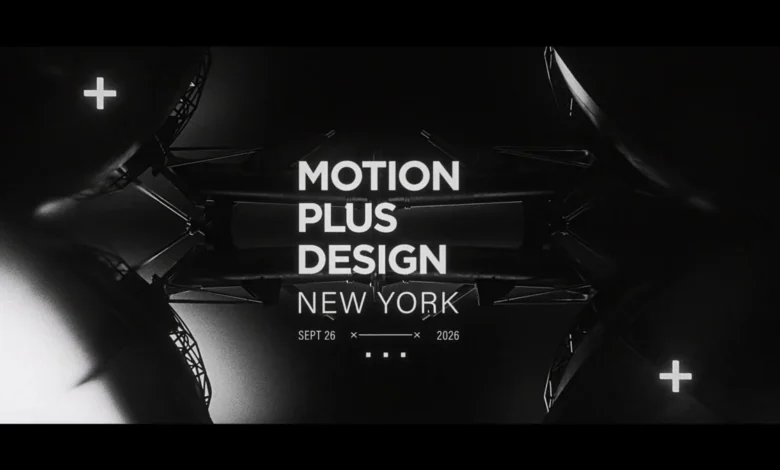
The global motion design community is converging on the borough of Brooklyn for one of the most anticipated creative gatherings of the year. Motion Plus Design New York 2026 is officially set to open its doors on Saturday, September 26, at the historic Roulette Intermedium located at 509 Atlantic Avenue. The day-long conference promises a comprehensive exploration of contemporary visual storytelling, cutting-edge technical innovation, and the artistic trajectories shaping the future of motion graphics. Serving as the grand opening centerpiece for the event is a specially curated premiere film that highlights the multifaceted talents speaking at this year’s summit, setting an ambitious and inspiring tone for the attendees.
As the motion design industry continues to evolve at a breathtaking pace, balancing traditional artistic craftsmanship with revolutionary technological advancements, events like Motion Plus Design serve as vital epicenters for professional development, networking, and creative inspiration. The 2026 edition holds even greater significance for the local and international design ecosystems as it coincides with a major milestone for one of the industry’s leading media platforms.
Main Facts of the Event
The 2026 iteration of Motion Plus Design New York brings together a stellar lineup of speakers, creators, and industry pioneers. The day’s schedule is structured to give audiences deep insights into the creative processes, challenges, and triumphs of leading figures in the motion design realm.
The roster of speakers features a diverse mix of acclaimed directors, animators, and technologists. Attendees will hear presentations from Mehdi Hadi, Saad Moosajee, Bhakti Patel, Danée Gosset, Brian Yoo, Rachel Brickel, and the creative powerhouse Vallée Duhamel. In addition to these independent creators and studio leaders, the conference bridges the gap between traditional artistry and technological infrastructure by featuring key representatives from the tech sector. Spenser Dickerson of the Render Network and Áron Filkey of Runway will take the stage to discuss how decentralized rendering and generative artificial intelligence are actively reshaping the daily workflows of motion designers worldwide.
Doors for the event open at 1:00 PM, with the comprehensive program scheduled to run continuously until the closing sessions conclude at approximately 7:15 PM. Tickets for the conference remain available through Eventbrite, with exclusive promotional discounts provided via media partners such as Motionographer.
Chronology and Weekend Timeline
The events surrounding Motion Plus Design New York 2026 extend far beyond the single-day conference, forming a comprehensive weekend-long celebration. This extended schedule is heavily intertwined with the twentieth anniversary of Motionographer, a digital publication that has chronicled, supported, and shaped the motion design industry for two decades.
The weekend’s chronological rollout begins on Friday, September 25, with the exclusive Founder House event. Designed as an intimate gathering for industry veterans, up-and-coming talents, and key community members, Founder House features a unique ticketing model: twenty seats were specifically drawn from a pool of eligible ticket holders, offering an intimate environment for high-level discourse and networking ahead of the main conference.
On Saturday, September 26, the focus shifts entirely to the Roulette Intermedium in Brooklyn for the core Motion Plus Design conference. Following a full afternoon and evening of keynote presentations, case studies, and technical deep-dives, the celebration continues late into the night. Saturday night features an official after-party at Mamacita, hosted at Deluxx Fluxx. Unlike the restricted-access Founder House, this celebratory gathering is open to the public, welcoming any attendee holding a free Dice ticket to join in commemorating two decades of motion design journalism and community building.
Supporting Data and Background Context
Motion Plus Design has established itself over the past decade as a premier international platform dedicated exclusively to the art of motion design. Originating in Paris before expanding to major creative capitals such as Tokyo, Los Angeles, and New York, the conference series fills a crucial gap in the design education landscape. It provides a physical stage where digital artists can step out from behind their monitors and share the deeply human, often arduous processes behind their screen-based creations.
The inclusion of technological entities like the Render Network and Runway at the 2026 New York event highlights a broader macro-trend within the digital arts sector: the convergence of high-end CGI production with cloud computing and machine learning. Industry data from creative employment and software utilization reports indicate a staggering year-over-year increase in the adoption of AI-assisted tools and cloud-based rendering pipelines among mid-sized and enterprise-level motion design studios. By bringing hardware infrastructure providers and AI developers directly into conversation with traditional motion directors, Motion Plus Design addresses the pressing need for education and critical discourse around these rapidly evolving tools.
Furthermore, Motionographer’s twentieth anniversary marks a significant historical milestone for the digital media landscape. Founded in the mid-2000s when the motion design industry was transitioning from broadcast-centric flash animation and early After Effects experimentation into a dominant global commercial force, the publication has served as an indispensable archive of the industry’s technical and aesthetic evolution.
Official Responses and Industry Perspectives
While individual statements from the diverse array of speakers reflect excitement for the live format, organizers and long-standing community partners have emphasized the importance of physical gatherings in an increasingly remote and digitally native industry.
In recent announcements regarding the dual celebration of the conference and Motionographer’s twentieth year, representatives highlighted the resilience of the creative community. The motion design industry has weathered significant economic shifts, technological revolutions, and global disruptions over the past twenty years. Platforms like Motion Plus Design and Motionographer have consistently acted as social tethers, ensuring that artists working in isolated home studios or massive agency pipelines remain connected to a shared cultural and artistic dialogue.
The decision to feature creators like Saad Moosajee and Danée Gosset alongside tech innovators from Runway and Render Network has also been praised by industry analysts as a balanced approach to modern creative education. Rather than shying away from disruptive technologies, the event’s programming directly confronts the friction points between human artistry and machine capability, fostering a healthy, forward-looking debate on authorship in the digital age.
Broader Impact and Implications for the Motion Design Industry
The convergence of top-tier creative talent and cutting-edge technological platforms in Brooklyn carries several important implications for the future direction of the motion design industry.
First, events of this scale serve as a barometer for the health of the commercial creative sector. As brands increasingly demand higher volumes of complex 3D content, immersive mixed-reality experiences, and rapid-turnaround visual assets, motion designers are under immense pressure to scale their output without sacrificing artistic integrity. The insights shared by studio leaders and independent directors at Roulette Intermedium will likely influence studio workflows, resource allocation, and project management strategies for the remainder of 2026 and into 2027.
Second, the prominent role played by AI and decentralized rendering platforms underscores a fundamental shift in skill acquisition for emerging designers. The traditional mastery of keyframes and manual rendering is increasingly being augmented—and in some cases challenged—by algorithmic generation and cloud-based parallel processing. Sessions led by representatives from Runway and Render Network provide a rare educational bridge, helping traditional artists understand how to harness these technologies as collaborative brushes rather than viewing them as existential threats.
Finally, the celebration of Motionographer’s twentieth anniversary within the framework of Motion Plus Design New York speaks to the enduring power of community-led media institutions. In an era dominated by algorithmic feeds and ephemeral social media content, dedicated long-form journalism and curated community platforms remain essential for preserving the history, elevating the standards, and defining the cultural identity of the motion design profession.
As the doors open at Roulette Intermedium on September 26, attendees will step into a space that honors two decades of shared history while boldly confronting the technological frontier of the next twenty years.