The 2027 Colors of the Year Predict a Return to Nature, Comfort, and Lived-In Spaces

Every autumn, the interior design and architectural communities turn their collective gaze toward the horizon, eagerly anticipating the definitive aesthetic forecasts for the upcoming year. At the center of this seasonal transition are the high-profile Color of the Year announcements issued by leading global paint manufacturers. These annual selections do far more than merely showcase appealing pigments; they serve as sophisticated socio-cultural barometers. Drawing upon evolving global aesthetics, shifting demographic attitudes toward domesticity, and changing psychological needs in an increasingly fast-paced world, these paint brands encapsulate the zeitgeist of contemporary living.
Over the past several decades, the significance of the Color of the Year has transcended the boundaries of interior wall treatments. These curated shades have matured into influential trendsetters that dictate trajectories across a vast spectrum of creative industries, including residential and commercial architecture, high-end furniture manufacturing, industrial product design, and global fashion runways. While each brand approaches the forecasting process through its own distinct brand identity and regional consumer research, their collective choices for 2027 reveal a striking macroeconomic and psychological alignment.
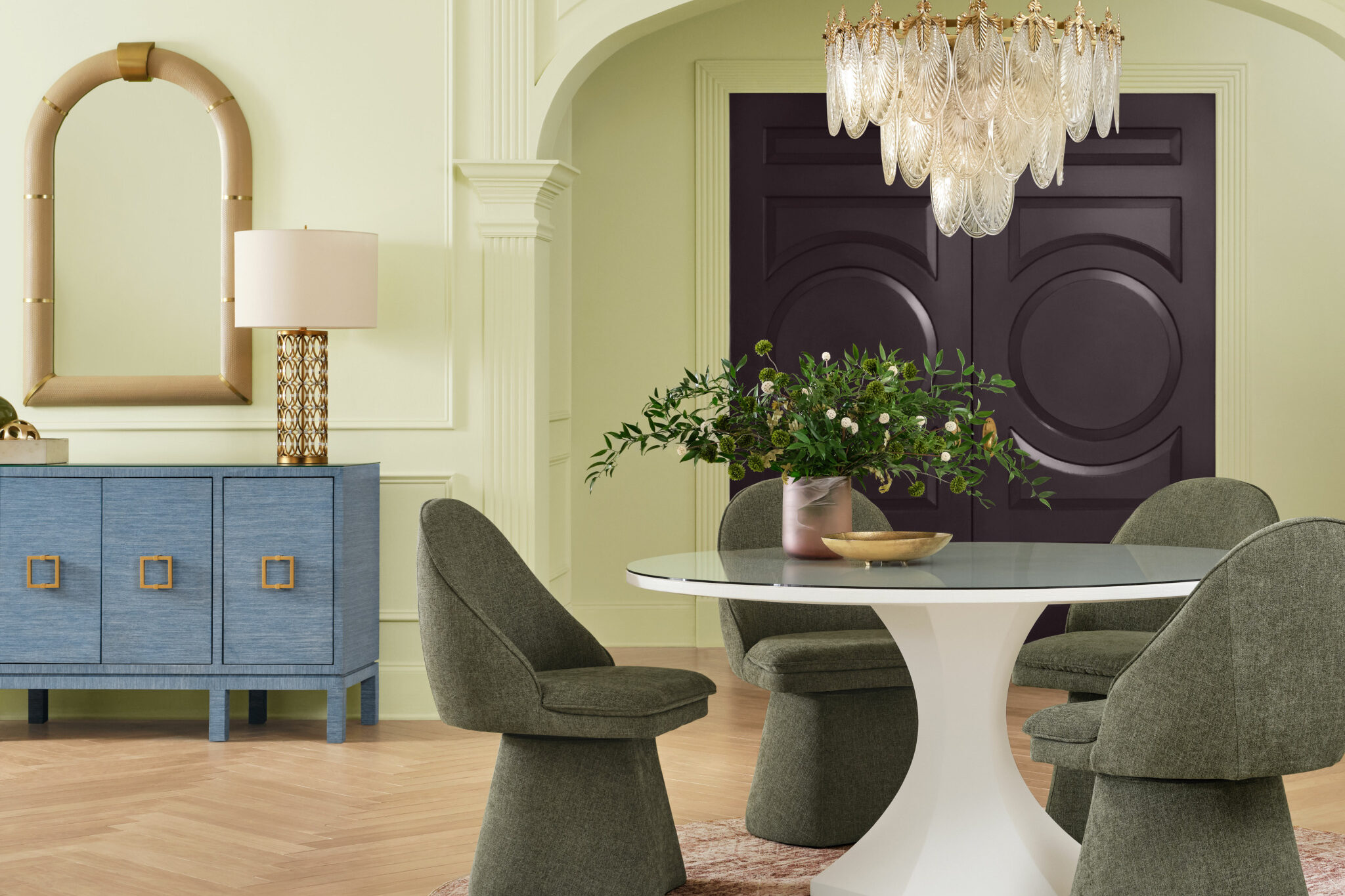
A comprehensive review of the 2027 forecasts indicates a definitive pivot away from the stark, ultra-minimalist neutrals and icy grays that dominated the previous decade. Instead, the design landscape for the coming year is anchored by a harmonious palette of rich greens, grounding earthy browns, and tranquil, muted blues. This chromatic shift reflects a collective human desire for sanctuary, environmental stewardship, and domestic spaces that feel deeply personal, restorative, and unapologetically lived-in.
The Evolution and Chronology of Color Forecasting
The tradition of selecting a singular defining color for the upcoming year originated decades ago as a clever marketing initiative by chemical and paint conglomerates. However, it has since evolved into a rigorous multidisciplinary science. Trend forecasting agencies employ teams of sociologists, color theorists, industrial designers, and cultural anthropologists who spend months monitoring global developments in technology, art, economics, and environmental science.

In the wake of global disruptions experienced throughout the early 2020s, residential spaces transformed from simple places of rest into multifunctional hubs encompassing offices, schools, and wellness retreats. Consequently, the psychological function of color shifted dramatically. In 2023 and 2024, the market witnessed an influx of high-saturation jewel tones and optimistic pinks and reds designed to inject energy back into locked-down populations. By 2025 and 2026, the pendulum swung toward restorative botanicals and warm, comforting neutrals.
Now, looking forward to 2027, the forecasting timeline has reached a maturity phase characterized by intentionality and longevity. Rather than chasing fleeting internet aesthetics or micro-trends, paint manufacturers are prioritizing enduring hues that foster long-term emotional well-being. This chronological progression highlights an industry responding directly to consumer demand for sustainability, durability, and emotional grounding within the built environment.
An Analysis of the 2027 Color Palettes

The 2027 selections can be neatly categorized into three primary aesthetic pillars: restorative greens, comforting browns and terracottas, and contemplative blues. Each manufacturer interprets these categories through its unique technical lens, resulting in a diverse yet cohesive spectrum of choices available to designers and homeowners alike.
Greens as Botanical Sanctuaries
Green continues its multi-year reign as a dominant interior force, symbolizing renewal, environmental consciousness, and psychological equilibrium. For 2027, brands have refined green shades to be more sophisticated, drawing heavily from organic, mossy, and historical references rather than bright, artificial tones.
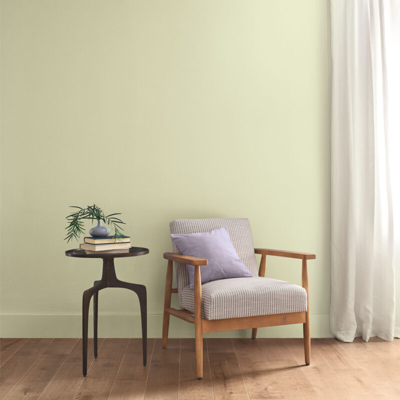
Benjamin Moore leads this charge with Webster Green, a sophisticated hue that bridges the gap between historical design and contemporary application. According to the brand’s design team, Webster Green carries the quiet authority of classic architecture while maintaining a fresh, forward-looking perspective that injects architectural character into any room.
Similarly, Behr introduces Grounded for its 2027 selection. Merging mossy olive tones with deep brown undertones, Grounded is engineered to blur the boundary between indoor living areas and the untamed natural world. Industry analysts note that shades like Grounded are increasingly specified in residential architecture to create seamless transitions between interior spaces and exterior landscape design.
Sherwin-Williams contributes to the botanical narrative with Celery, an airy, pastel-tinted green that emphasizes well-being and spatial lightness. Functioning equally well as a subtle, restorative background or a vibrant focal accent, Celery successfully balances the line between organic neutrality and modern chromatic expression.

The Warmth of Earthy Browns and Terracottas
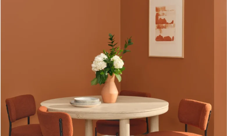
As consumers seek tactile warmth and historical continuity in their homes, brown has emerged as the definitive neutral for 2027. Moving far away from the heavy, reddish wood tones of past decades, contemporary brown paint formulations are desaturated, atmospheric, and deeply complex.
Little Greene has selected Marle as its flagship shade for 2027. Described by Creative Director Ruth Mottershead as a sumptuous yet relaxed hue, Marle reflects a broader resurgence of understated browns across both haute couture fashion and high-end residential interiors. The color is specifically designed to foster comfort and visual weight, softening cavernous modern spaces into intimate retreats.

Dunn-Edwards echoes this sentiment with French Press Coffee. This silky, rich brown evokes historic luxury and architectural gravitas. Industry experts point out that the adoption of dark, atmospheric browns signals a departure from fear of commitment to dark walls, encouraging homeowners to embrace cozy, cocooning environments.
Dutch Boy Paints leans into the earth with Deep Rooted, an organic terracotta hue infused with warm, dependable undertones. Deep Rooted is formulated to encourage personalized, lived-in environments that validate the human need for stability and connection to the earth.
In the realm of mineral-inspired pigments, Graham & Brown offers Rose Earth. Inspired by the natural mineral deposits found in Italian clay, Rose Earth connects modern construction with centuries-old painting traditions, wrapping rooms in a subtle pink enriched by a warm terracotta base. Expanding on this chromatic family, C2 Paints introduces Pueblo, an earthy pink and mauve tone that invites physical interaction with the living environment, transforming static rooms into engaging, tactile spaces.

Contemplative Blues and Muted Aquas
While warm earth tones dominate a significant portion of the 2027 forecasts, blues remain essential for their psychological calming properties and ability to expand spatial perception. However, the 2027 blue selections are notably softer, smokier, and more reflective than the vibrant navy blues of previous years.
Valspar captures this mood with Cottage Door, a muted blue that draws on the raw, natural beauty of coastal and rural materials. Designed to adapt seamlessly to changing seasonal light, Cottage Door celebrates the beauty of imperfection and personal history.

Glidden approaches the blue spectrum with Artifact, a calm, muted aqua hue. Artifact offers consumers an accessible method for refreshing interiors without undertaking costly renovations, serving as a versatile backdrop that modernizes the ubiquitous minimalist white wall trend while adding a delicate wash of atmospheric color.
California Paints contributes Quiet Peace, a deep, moody blue engineered to counteract the hyper-connectivity and sensory overload of modern digital life. By creating a profound sense of visual silence, Quiet Peace fosters a thoughtful relationship between the inhabitant and the architecture.
Finally, Clark+Kensington (available exclusively through Ace Hardware) rounds out the blue offerings with Vantage Point, a radiant shade designed to inject crisp, uplifting energy into functional spaces like home offices and kitchens.

Economic, Environmental, and Market Implications
The collective industry alignment on greens, browns, and muted blues for 2027 carries significant economic and environmental implications for the global building materials and home goods sectors.
From a manufacturing standpoint, the formulation of these complex, desaturated hues requires sophisticated chemical engineering, particularly as paint brands face increasingly stringent regulations regarding volatile organic compounds (VOCs). Consumers are demanding zero-VOC and low-VOC formulas that do not sacrifice depth of color or durability, pushing research and development departments to innovate continuously.

Furthermore, the emphasis on longevity and "lived-in" aesthetics directly counters the fast-furniture and fast-decor culture that dominated the late 2010s. By promoting colors that are not bound to fleeting seasonal cycles, paint manufacturers are encouraging consumers to invest in timeless home improvements that reduce renovation waste. This sustainable mindset aligns with broader macroeconomic trends prioritizing circular economies and durability in residential real estate.
Real Estate and Interior Architecture Reactions
Interior architects and residential real estate developers have responded favorably to the 2027 color forecasts. High-end property stagers and architectural designers note that palette consistency across multiple major paint manufacturers provides a clear roadmap for home staging and pre-market renovations.

"When major brands like Benjamin Moore, Sherwin-Williams, and Behr independently converge on earthy, restorative palettes, it sends a powerful signal to the market," notes a leading architectural color consultant based in New York. "For developers and designers, these colors provide a universal language of comfort. They assure prospective home buyers that the property is modern, emotionally grounding, and aligned with contemporary wellness values."
As these colors roll out across retail shelves, design showrooms, and digital platforms throughout 2027, their ultimate success will be measured by how seamlessly they integrate into everyday human lives. Far from being mere marketing constructs, these 12 distinct shades represent a collective societal effort to design homes that act not just as shelters, but as active participants in human health, emotional resilience, and sustainable living.
Related posts: