John Kenn Mortensen and the Dark Fantasy World of FLASK: An Artistic Evolution

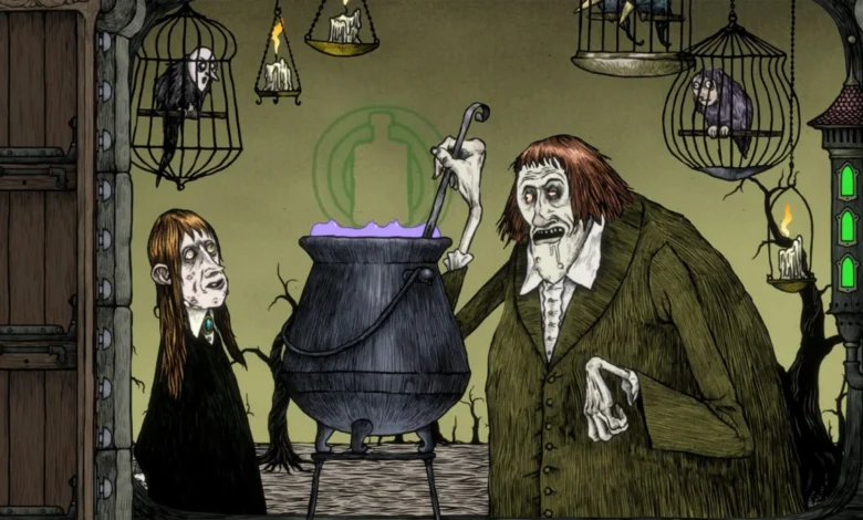
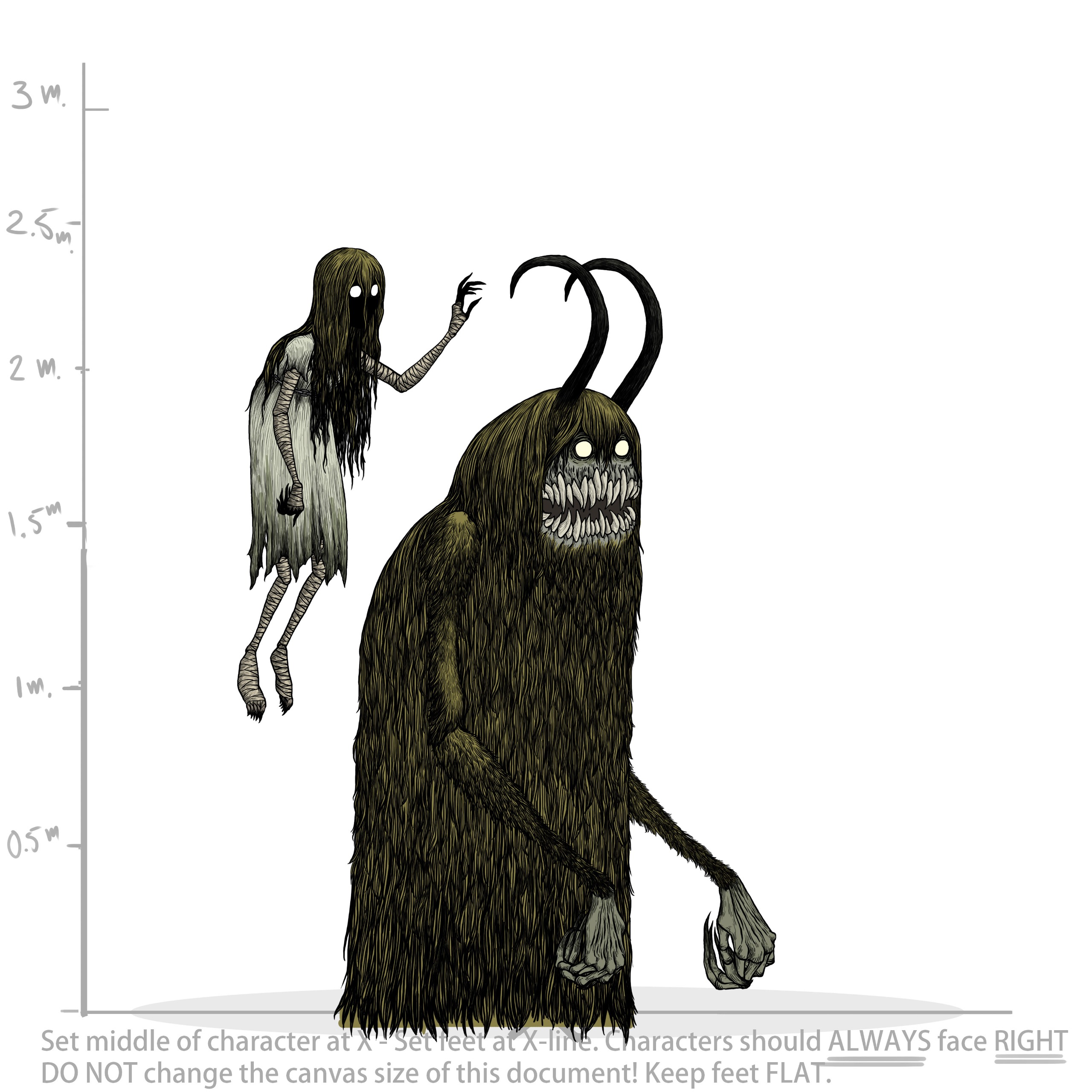
The intersection of traditional macabre illustration and modern digital game design has found a haunting new expression in FLASK, a dark fantasy roguelike deckbuilder developed by Chop Chop Games. This collaboration marks a significant career milestone for Danish artist John Kenn Mortensen, whose signature style—defined by scratchy, ink-heavy lines and unsettling, otherworldly entities—has been transposed from the static pages of sketchbooks and comics into a dynamic, interactive environment. As the gaming industry continues to seek unique visual identities to differentiate titles in a saturated market, the inclusion of Mortensen’s distinct, hand-crafted aesthetic provides a case study in how analog art can successfully anchor digital experiences.
The Genesis of a Dark Aesthetic
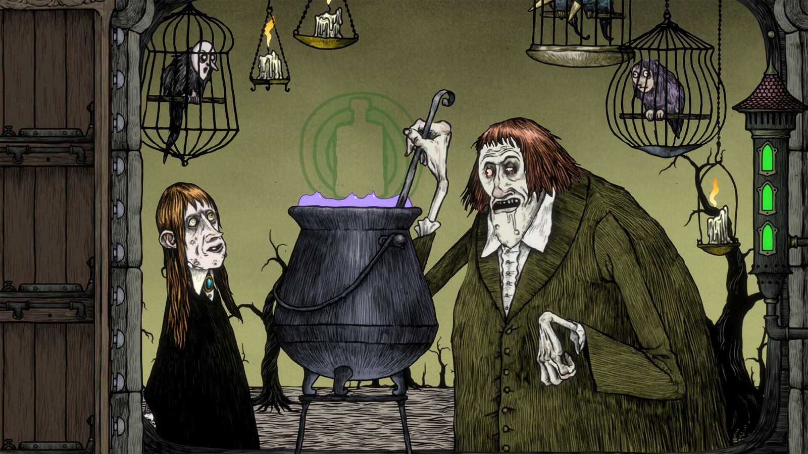
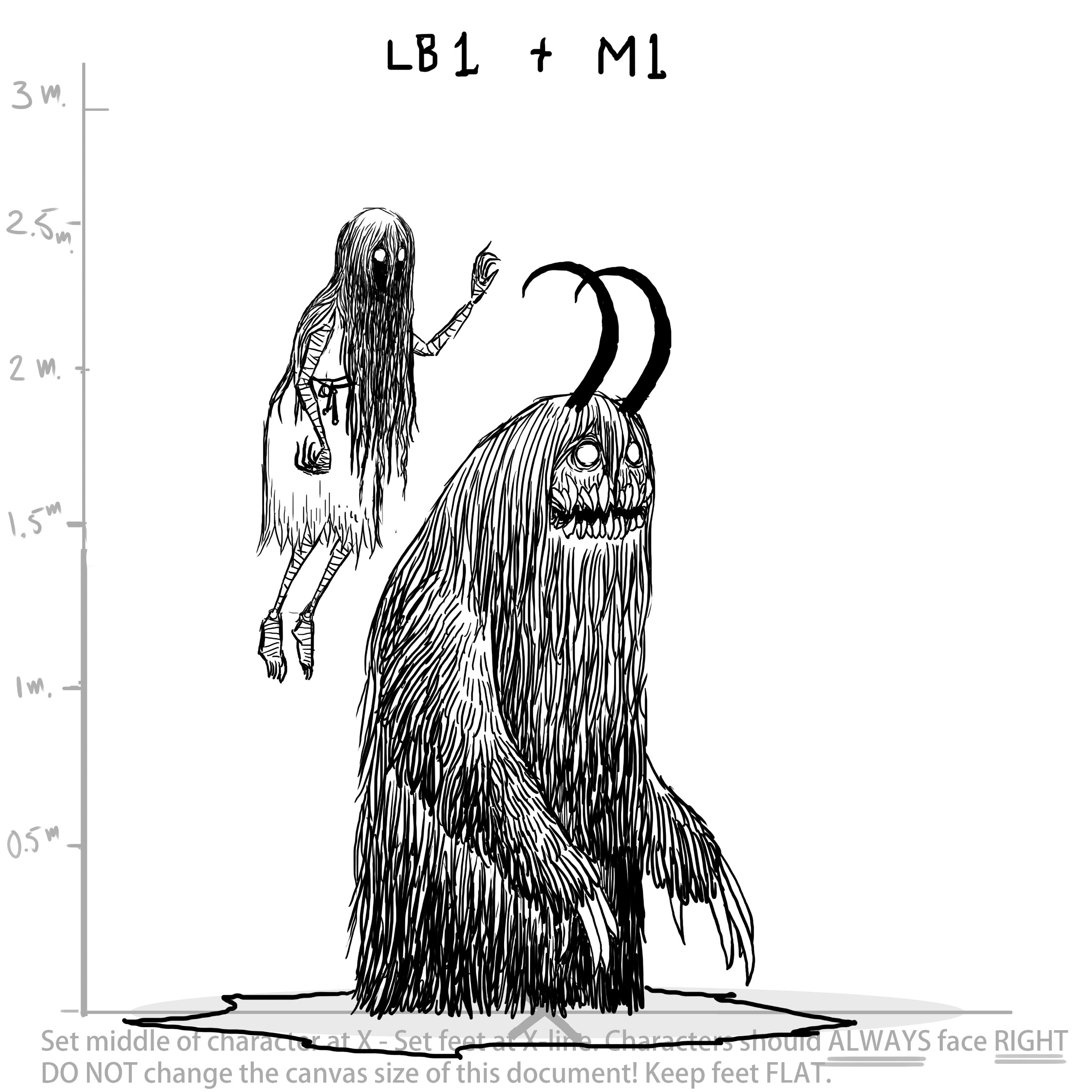
John Kenn Mortensen has long been a cult figure in the illustration world, recognized for his ability to tap into a primal, almost folkloric sense of dread. His portfolio, which spans decades of work in animation, children’s literature, and independent publishing, is characterized by a "dark room" philosophy. Mortensen describes his creative process as an attempt to peer into the shadows, offering a glimpse of secrets that exist just outside of the light.
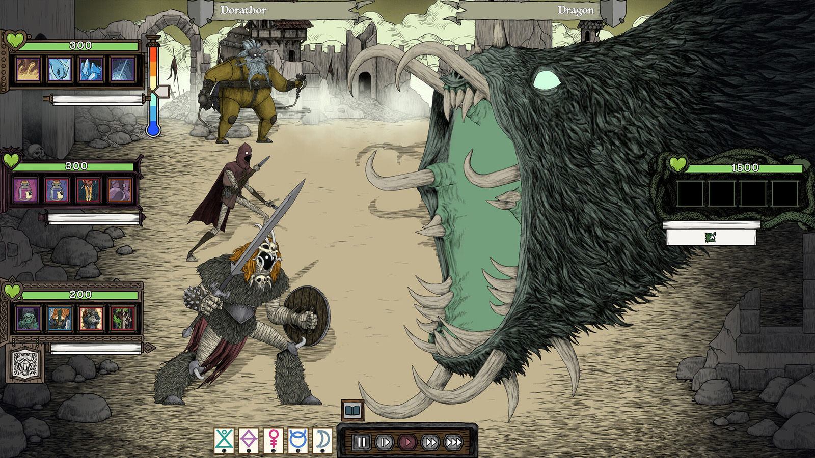
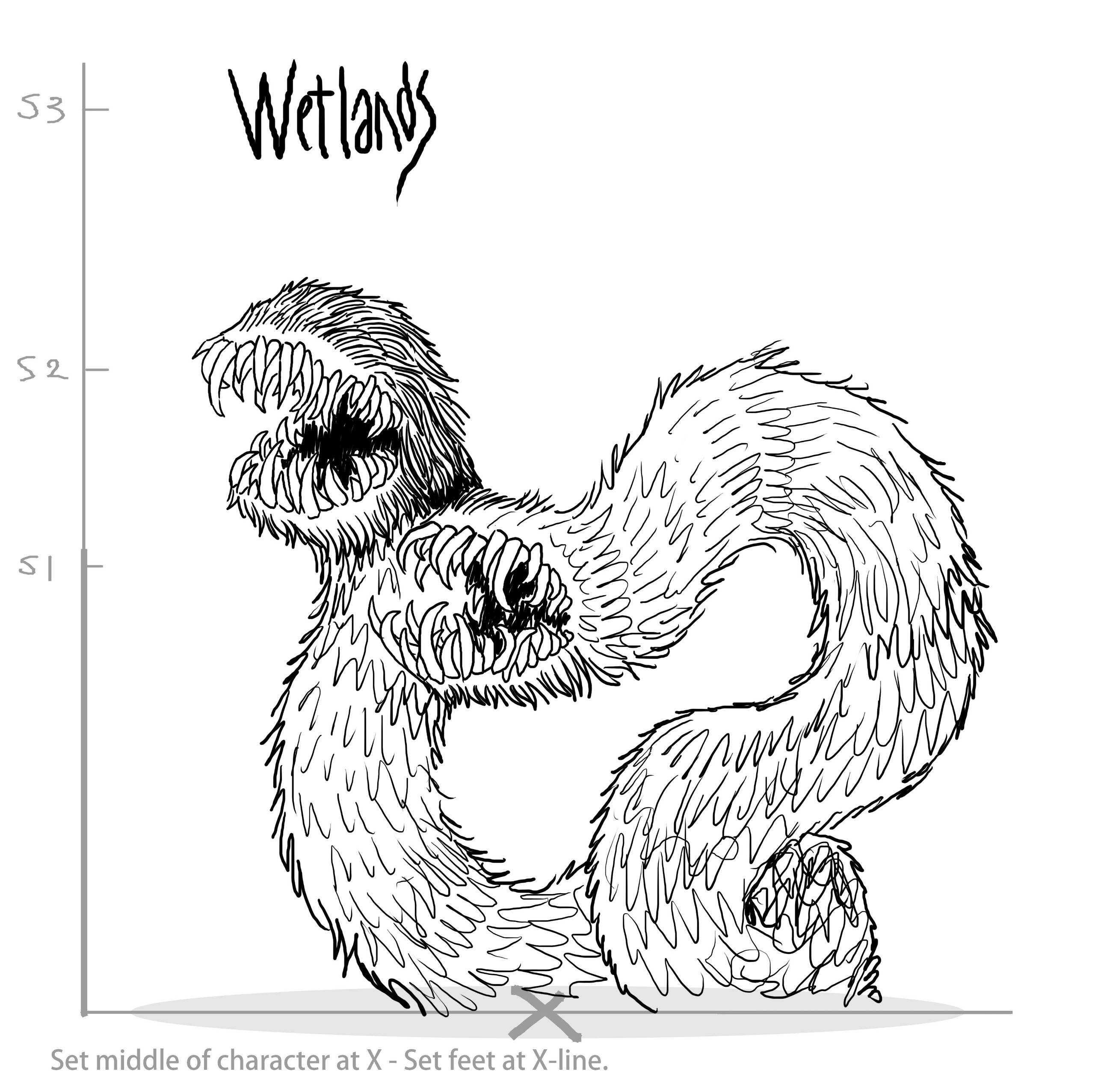
The visual language of FLASK, however, required a shift from this solitary, monochrome practice to a collaborative development cycle. In joining forces with Chop Chop Games, Mortensen had to adapt his pen-and-paper sensibilities to the requirements of game mechanics. The game itself functions as a roguelike deckbuilder, a genre that necessitates clarity and readability for the player. Balancing the intricate, often chaotic nature of Mortensen’s monsters with the functional needs of a card-based UI presented a primary challenge for the development team.

Bridging the Gap: From Sketchbook to Screen
The development of FLASK is not merely a translation of existing art into a game engine; it is a synthesis of two distinct creative worlds. For the developers, Dario and Michael of Chop Chop Games, the objective was to build a foundation of robust mechanics—auto-battler systems and complex theory-crafting—and then layer Mortensen’s vision over that framework.
Mortensen cites the 1986 Jim Henson cult classic Labyrinth as a foundational touchstone for the game’s visual tone. This choice of inspiration is telling; Labyrinth is celebrated for its tactile, puppet-based practical effects and its commitment to a gritty, high-fantasy aesthetic that rejects the sterile, overly-polished look of modern digital art. By infusing the game with the same "lived-in" dirt and decay, the team has managed to maintain a cohesive atmosphere. Furthermore, Mortensen has noted that the high-energy, aggressive aesthetic of thrash metal—specifically the discography of the band Slayer—informed the kinetic energy of his creature designs.
Technical Challenges and Artistic Integration
The transition to digital development necessitated a departure from Mortensen’s traditional black-and-white medium. For an artist who has spent the majority of his career working in ink on paper, the introduction of color, light, and shadow to his designs was a transformative experience.
"Conveying the feelings in my art with color has been a huge challenge," Mortensen explained. In the digital environment of FLASK, the team utilized lighting effects and color grading to create depth that his original sketches could not possess. Crucially, the team implemented a rule for all supporting artists: Mortensen’s style represents the "real world" of the game’s universe. Other artists were tasked with interpreting their own work through the lens of that world, ensuring that even when the cards were designed by different hands, they felt like components of a singular, unified reality. This structural approach allowed the team to preserve the "hand-crafted" quality of the art while maintaining the functional requirements of the user interface.
The Broader Implications for Indie Game Design
The development of FLASK arrives at a time when the independent game market is increasingly valuing "auteur" aesthetics. As tools for game development become more accessible, the differentiator for many titles is no longer just the complexity of the code, but the strength and consistency of the art direction.
By integrating a world-renowned illustrator into the core development process, Chop Chop Games has effectively utilized Mortensen’s brand and unique visual identity as a primary marketing and design pillar. This strategy reflects a growing trend in the industry: the "artist-first" approach to game design, where the visual language is established before the mechanics are finalized, ensuring that the player experience is visually immersive from the first interaction.
Chronology and Development Context
The project, which has been in active development leading up to its release on the Steam platform, serves as a celebration of several artistic milestones. The 40th anniversary of Labyrinth provided a thematic backdrop for the production, allowing the team to lean into a nostalgic yet dark interpretation of fantasy.
Mortensen’s own career trajectory has been defined by his ability to pivot between platforms. From working on television shows and animation to producing comics and exhibition-level art, he has treated his career as a "house with many rooms." His involvement in FLASK is the latest such room, and he has indicated that the process has sparked a cascade of new creative ideas. For the developers, the benefit of this partnership was immediate access to a pre-existing, highly recognizable, and fan-vetted visual style that would have taken a new team years to cultivate from scratch.
Market Response and Future Outlook
As FLASK enters the market, it joins a competitive field of roguelike deckbuilders, including titles like Slay the Spire and Balatro. However, its aesthetic differentiation—relying on the grotesque, high-contrast, and deeply textured work of a veteran illustrator—gives it a distinct identity in the storefront.
The success of this integration will likely be measured not just by player count or review scores, but by the extent to which the community resonates with the "uncanny" nature of the game’s world. The early reception suggests that the combination of deep, strategic gameplay and the visceral, hand-drawn art style is a winning formula for the target demographic of dark fantasy enthusiasts.
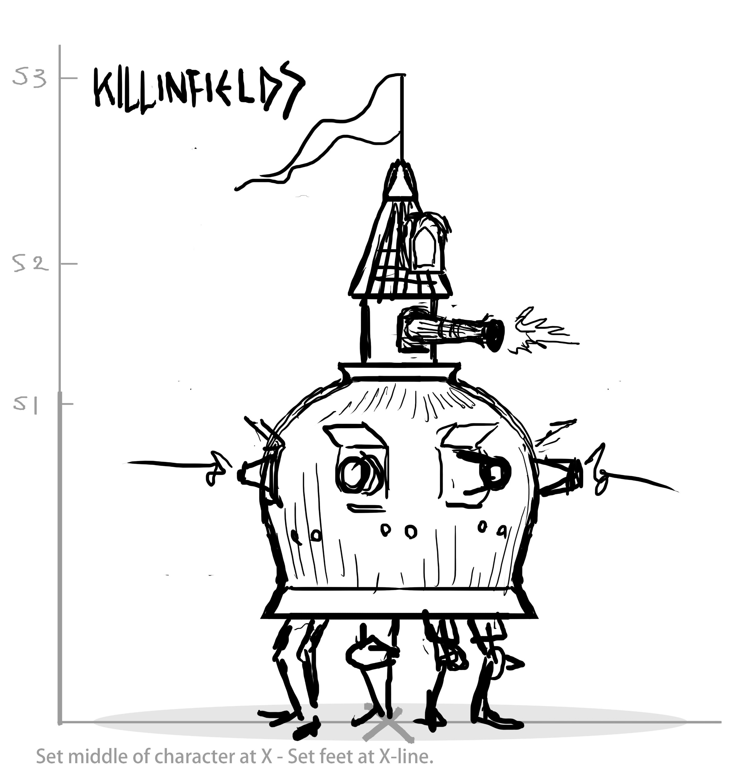
Looking ahead, the collaboration serves as a potential blueprint for other independent studios. The success of such a project hinges on a high degree of trust between the traditional artist and the digital developers. By allowing the artist’s "bad habits"—the very things that define his unique style—to remain untouched while the technical team handles the implementation, Chop Chop Games has successfully bridged the gap between the page and the pixel.
Conclusion
FLASK stands as a testament to the power of artistic collaboration in the digital age. By blending the raw, monochromatic power of John Kenn Mortensen’s illustrations with the structured, strategic depth of a modern roguelike, the team has created an experience that feels both familiar to fans of his previous work and entirely fresh as a gaming product. Whether the title becomes a staple of the genre or remains a cult favorite, the project marks an important moment in the evolution of digital art, proving that even in a world of high-fidelity 3D assets, there is a profound, enduring demand for the messy, ink-stained beauty of the human hand.