Decoding the American Interior: Samplize Report Reveals Massive Shift Toward Warm, Deep Paint Palettes

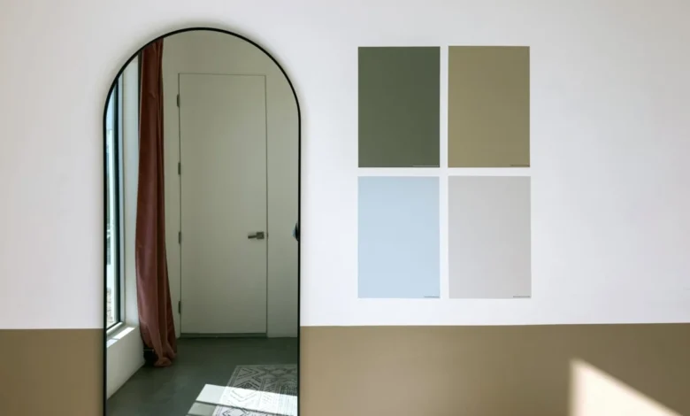
Traditional paint industry forecasting has long relied on a top-down model. Paint manufacturers designate high-profile Colors of the Year, trend forecasters assemble emerging palettes, and interior designers publish speculative predictions regarding the hues that will dominate the coming architectural seasons. Yet, this conventional framework captures only the final destination of a design project rather than the turbulent exploratory journey undertaken by everyday homeowners. To understand what consumers genuinely contemplate before committing to a gallon of paint, one must look upstream to the sampling phase—the critical moment when palettes are rigorously tested side by side on actual walls.
The inaugural Samplize American Paint Color Report offers unprecedented visibility into this transitional phase. By analyzing millions of paint samples ordered across the United States during the first six months of 2024, 2025, and 2026, the report tracks consumer behavior across industry heavyweights Benjamin Moore, Farrow & Ball, and Sherwin-Williams. Rather than measuring what people ultimately purchase, this dataset exposes the exhaustive shortlists homeowners build, revealing a profound and accelerating psychological shift in how Americans approach interior color.
Unlocking the Sampling Stage: A New Methodology in Trend Analysis
For decades, the home improvement and decor industries have measured consumer demand through retail sales data and post-purchase surveys. While useful, these metrics suffer from survivorship bias, reflecting only the final survivor of an often chaotic decision-making process. The introduction of the Samplize report bridges this gap by quantifying the consideration set—the universe of competing colors a homeowner tapes to their drywall before making a final investment.
Makenna Lutz, partnerships lead at Samplize, emphasizes that scrutinizing this sampling stage illuminates three distinct pillars of consumer decision-making: the comprehensive shortlist an individual actually weighed, the specific hues tested in direct competition against one another, and the cross-brand nature of these shortlists. Because homeowners frequently order peel-and-stick samples from multiple competing manufacturers simultaneously, the data provides a holistic, brand-agnostic view of consumer intent that traditional single-brand sales figures cannot capture.
A Dramatic Three-Year Warming Trend Across the United States
The overarching narrative emerging from the multi-year dataset is a decisive pivot away from cool aesthetics. Over the three-year study period, warm colors grew nearly three times faster than cool colors. By the midpoint of the data collection window, warm hues accounted for 69.4 percent of all color samples ordered through the platform, a notable increase from the 64.3 percent recorded two years prior.
This polarization is further underscored by the composition of consumer shortlists. Half of all American paint shortlists now contain zero cool colors—a substantial rise from the 43 percent observed at the inception of the study. For interior designers and color theorists, this milestone signals that the decades-long dominance of stark grays and clinical cool whites is rapidly receding in residential architecture.
Disproving the Beige Myth: The Rise of Deep Warmth
It would be reductionist to interpret this widespread warming trend merely as a resurgence of the safe, pale beiges and creamy off-whites that defined early-2000s suburban interiors. While lighter neutral tones certainly maintain a robust presence, the most striking revelation of the data lies in how this warming trend cuts across different levels of color saturation and depth.
According to Lutz, industry analysts initially expected the transition toward warmth to manifest as a general lightening of spaces—a collective movement toward airy, sun-bleached pastels. However, the empirical data defied this hypothesis. Warm colors outgrew cool colors across every single depth category. Most notably, the deepest warm tones experienced the most explosive growth of all, scaling at roughly six times the rate of deep cool tones.
This bifurcated movement places delicate blush-toned plasters and warm creams on one end of the spectrum, and rich, saturated pigments on the other. On the lighter side, consumers frequently juxtapose products such as Farrow & Ball’s Setting Plaster, Benjamin Moore’s Proposal, and Sherwin-Williams’ Malted Milk. Conversely, dark and dramatic tones maintain a fierce grip on consumer imagination, though their underlying temperature has shifted. Benjamin Moore’s Classic Burgundy—one of the deepest, most dramatic colors included in the study—grew at a pace comparable to the lightest pastels. Homeowners have not lost their appetite for moody, enveloping interiors; rather, the emotional temperature of that drama has fundamentally transformed from cool midnight blues and charcoal grays to rich, garnet-imbued warmth.
The Brown Renaissance: Greiges, Stones, and Muted Neutrals
This gravitation toward earthy sophistication is mirrored in the phenomenal ascent of brown shades, which expanded faster than any other color family during the observation window. Brown tones now appear in 13.4 percent of all consumer shortlists, up significantly from 9.2 percent at the start of the research period.
Crucially, the vanguard of this brown renaissance is not composed of the heavy, saturated chocolate browns or rustic terracottas of previous decades. Instead, consumer shortlists are heavily populated by nuanced hybrids: sophisticated greiges, warm grays, and weathered stone shades. Formulations such as Sherwin-Williams’ Warm Stone and Urbane Bronze, Farrow & Ball’s London Clay, and Benjamin Moore’s Smokey Taupe are driving this growth. These colors function as chameleons, offering the grounded utility of traditional neutrals while infusing spaces with a subtle, organic warmth that bridges contemporary minimalism and classic comfort.
Green Establishes Permanent Roots in the American Home
While warm neutrals and earthy browns capture the fastest-growing segments, green has successfully transitioned from a passing trend into a permanent architectural staple. Having surged dramatically in popularity during the early phases of the decade, green has stabilized at an elevated plateau, currently appearing in 34.6 percent of all consumer shortlists.
The versatility of green explains its staying power. Modern homeowners are not testing a single shade of green; rather, the shortlists reflect a broad botanical spectrum ranging from soft, silvery sages and muted mosses to deep, forest-inspired conifers. This enduring presence suggests that green is now viewed by consumers as a neutral element capable of bringing biophilic design principles indoors without overwhelming a room’s spatial dynamics.
Behavioral Insights: The Binary Nature of Color Temperature Selection
Beyond specific color families, the Samplize report sheds light on the psychological mechanics of color selection. The data reveals that temperature consistency governs the vast majority of consumer shortlists. Two-thirds of all shortlists contain colors drawn from only a single temperature group. Specifically, half of all shortlists are entirely warm, while roughly one-third remain exclusively cool.
This behavioral rigidity indicates that homeowners rarely deliberate between drastically opposing emotional atmospheres; instead, they refine their choices within a predefined thermal boundary. When a consumer decides a room should feel cozy and sunlit, their comparative sampling remains strictly within the warm spectrum, testing subtle variations of tone and depth rather than second-guessing the core temperature of the space.
Furthermore, there is compelling evidence that this warming palette is becoming increasingly chromatic. While neutrals anchor the bulk of the data, pink and red represent the fastest-growing color families when measured from smaller baseline starting points. The combination of warm and deep emerged as the single fastest-growing quadrant of temperature and depth cross-analysis, signaling an appetite for bold, cocooning color applications.
Broader Implications for the Paint and Design Industries
While three years of sampling data cannot serve as an infallible crystal ball for the future of American interior design, the findings carry profound commercial and aesthetic implications. The data proves that the contemporary consumer is not simply seeking refuge in lighter, quieter neutrals. Across the board, from delicate plaster pinks to weathered stone browns and profound burgundy reds, Americans are actively exploring warmth across the entire spectrum.
For paint manufacturers, interior designers, and home improvement retailers, these insights demand a recalibration of marketing and product development strategies. As consumers increasingly rely on direct-to-consumer sampling methods to reconcile cross-brand palettes, understanding the nuances of the shortlist phase becomes paramount. The modern homeowner is methodical, experimental, and decisively drawn toward environments that offer emotional resonance and tactile warmth—marking a definitive chapter close for the era of unyielding cool minimalism.