How to Choose the Best Accordion Icons for Optimal User Experience and Navigation Clarity

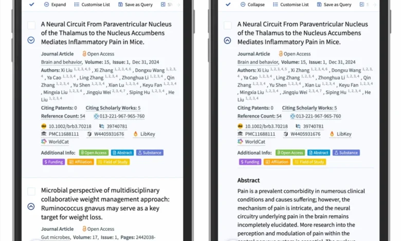
The design of navigational components—specifically the accordion menu—remains a point of significant friction in modern web interface development. While developers often view these elements as simple containers for hiding and revealing content, recent research from the Nielsen Norman Group (NN/g) indicates that the choice of visual signifiers profoundly impacts user behavior, error rates, and task completion times. The consensus among usability experts is that the "caret" is the most reliable icon for signaling expand-and-collapse functionality, while the use of "split menus" and inconsistent labeling often leads to navigational confusion.
The Evolution of Accordion Usability Standards
For decades, the web has lacked a universal standard for accordion interaction. During the early 2000s, websites frequently utilized custom graphical elements or text-based links to reveal hidden content. As responsive design became the standard, the necessity for space-saving patterns like the accordion grew, leading to a proliferation of icon choices. Designers began experimenting with plus signs, various arrow orientations, and even proprietary graphical markers to indicate that a user could trigger a content expansion.
However, the lack of a standardized visual language has created a cognitive burden. When a user encounters an unknown icon, they must infer its functionality based on previous experience, leading to "click-testing"—a behavior where users interact with elements to determine their purpose rather than relying on intuitive design. Research confirms that when users are forced to guess, they are significantly more likely to abandon the task or navigate to the wrong destination.

Empirical Data on User Interaction Patterns
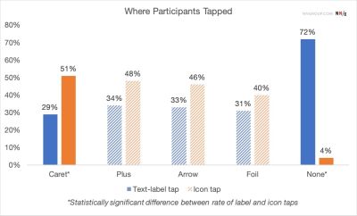
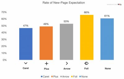
A comprehensive study conducted by NN/g, which tracked user interactions across various icon sets, revealed critical insights into how users interpret interface signals. The study found that in the absence of any icon, users overwhelmingly assume that a menu item is a direct link to a new page rather than a trigger for an in-page element.
Furthermore, the data suggests that the hit area is heavily influenced by the icon. When a caret is used, users are more likely to target the icon itself, whereas with other symbols, the interaction is split between the text label and the icon. This indicates that the icon does not just serve as a visual decoration; it functions as a primary affordance. When designers implement "split menus"—a pattern where clicking the text label navigates to a new page while clicking the icon expands the menu—they create a high-risk scenario for user error. In these instances, the user is frequently trapped in a cycle of unintended page loads, leading to frustration and increased bounce rates.
The Case for the Caret as the Industry Standard
The analysis concludes that the caret (a downward-pointing triangle) is the most effective symbol for signaling a collapsible section. This is attributed to the caret’s long-standing usage in desktop operating systems and early software interfaces, which has ingrained it into the collective mental model of digital users.
In contrast, the "plus" sign (+) is frequently misinterpreted. While it is commonly understood to mean "add" or "expand," in e-commerce and complex data environments, it can also signify "add to cart," "save for later," or "zoom in." This ambiguity makes it a suboptimal choice for navigation. Similarly, directional arrows (pointing left, right, up, or down) are often overloaded with secondary meanings, such as page scrolling, document navigation, or pagination. By utilizing a simple, static, or state-changing caret, designers can effectively lower the cognitive load required to navigate a site.

The Pitfalls of Split-Button Architectures
The "split-button" pattern, while intended to offer users maximum control, has proven to be a significant usability flaw. By forcing the user to distinguish between two distinct interaction zones on a single line item, designers are violating the principle of least astonishment.
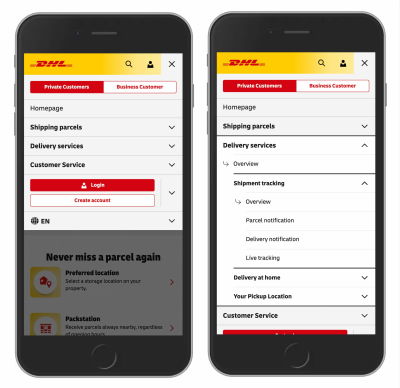
Industry analysis shows that users do not differentiate between the "text part" and the "icon part" of an accordion header with enough precision to avoid error. When a user clicks a label intending to expand a menu but is instead redirected to a new URL, the experience is perceived as a system failure. Major logistics and e-commerce platforms, such as DHL, have moved toward more simplified, single-action navigation. In these models, the header serves exclusively to expand the menu, and the "overview" or "landing page" link is placed as the first item inside the expanded list. This approach ensures that every click on the primary menu item produces a predictable, consistent result.
Strategic Implications for Web Design
The transition toward standardized, minimalist design patterns is not merely an aesthetic choice; it is a fundamental requirement for accessibility and performance. Websites that adopt the caret-only approach report higher levels of user satisfaction and lower support costs associated with navigation-related queries.
The strategy for implementation can be broken down into three core pillars:
- Uniformity: Use the caret pointing down for collapsed states and a caret pointing up or sideways for expanded states.
- Explicit Linking: If a menu item must act as a link to a page, do not attempt to force it into an accordion. Use an underline to signify that the text is a destination. If the item must also reveal a submenu, separate the "destination" link from the "expander" trigger within the navigation structure.
- Removal of Redundancy: Remove all unnecessary arrows, plus signs, and custom animations that do not serve an immediate functional purpose. Simplicity reduces the surface area for user error.
Broader Impact on Accessibility and User Retention
The broader implications of these findings extend to web accessibility and search engine optimization (SEO). When navigational elements behave consistently, screen readers and assistive technologies can better interpret the hierarchy of the site. Furthermore, consistent interaction patterns reduce the amount of time users spend learning how to navigate a specific site, which is a key metric in customer retention.
As web standards continue to evolve, the industry is seeing a shift toward "design systems"—collections of reusable components that enforce these best practices. By standardizing the accordion interaction, organizations can ensure that their digital products remain intuitive across mobile, tablet, and desktop devices. The evidence suggests that for the foreseeable future, the most "innovative" design choice is often the one that adheres most closely to established, tested, and reliable human-computer interaction (HCI) patterns.

Designers and developers are encouraged to audit their existing navigation components against these findings. The objective is to strip away the "noise" of over-designed icons and return to a functional, predictable, and clear interface. In the competitive landscape of the modern web, where user attention is the most valuable currency, the clarity provided by a properly implemented caret icon is a small but essential investment in the overall quality of the user experience. By avoiding the pitfalls of split-button patterns and ambiguous symbols, teams can build navigation systems that serve as a bridge, rather than a barrier, to content.
Related posts: