The digital landscape for spiritual services is undergoing a significant aesthetic evolution as platforms move away from traditional, often cliché iconography in favor of sophisticated, high-design identities. Purple Garden, a prominent player in the online psychic and spiritual guidance sector, has recently unveiled a comprehensive brand overhaul. Developed in collaboration with the creative agency Mother Design, this project stands out not merely for its visual output, but for the unconventional, process-driven methodology employed to bridge the gap between abstract spiritual concepts and tangible brand assets.
A Departure from Conventional Design Methodologies
The branding industry typically relies on data-driven metrics, competitor analysis, and focus-group testing to establish a brand’s visual direction. However, for a platform rooted in the intangible—such as tarot, astrology, and clairvoyance—Mother Design opted for a "Wild Card" approach. This initiative, a hallmark of the agency’s internal experimentation culture, encouraged the creative team to bypass standard digital design workflows in favor of tactile, intuitive exercises.
The creative process began with a collaborative workshop involving a holistic practitioner from the Purple Garden network. This immersion was designed to provide the designers with a direct, firsthand experience of the services the platform provides. By engaging in chakra readings, automatic drawing, and spontaneous writing sessions, the creative team sought to channel the essence of the spiritual experience into the brand’s visual DNA. This method mirrors the historical artistic practices of Hilma af Klint and the "The Five," a collective of women who used trance-like states to produce abstract art they believed was guided by a higher consciousness. By adopting this approach, Mother Design moved beyond the superficial aesthetics often associated with the psychic industry—such as overused star charts and generic neon hues—to create a visual language that felt authentic to "seasoned seekers."
The Visual Language of Growth and Intuition
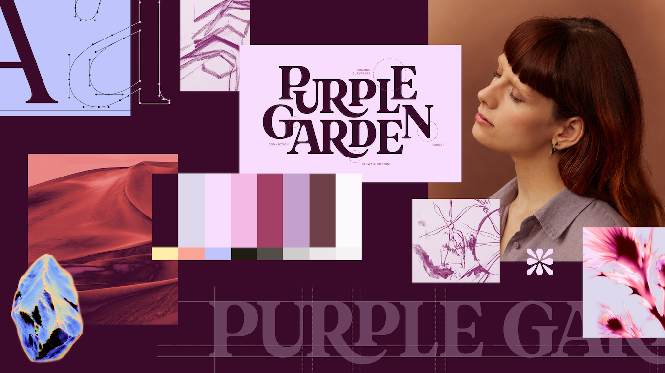
The resulting brand identity is a study in fluid geometry and organic growth. The new wordmark serves as the anchor of this identity, utilizing elegant serifs that appear to be in a state of constant expansion. The design incorporates curved junctures, suggesting that the letters are literally sprouting, a visual metaphor for the ongoing personal development that Purple Garden’s users seek.
Supporting the primary wordmark is a custom digital-first, crystal-like glyph system. These symbols serve as the visual shorthand for the platform’s diverse offerings, including dream analysis and psychic intuition. To ensure both form and function, the design team implemented a dual-typeface strategy. The use of Literatura Present and ABC Social balances the need for whimsical, spiritual storytelling with the rigorous demands of modern, mobile-first legibility.
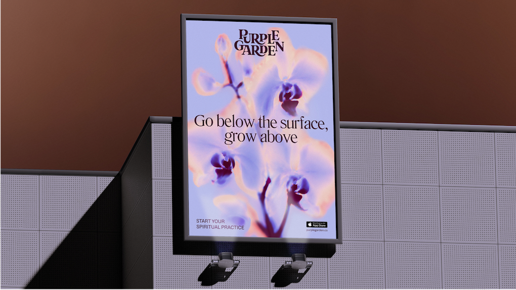
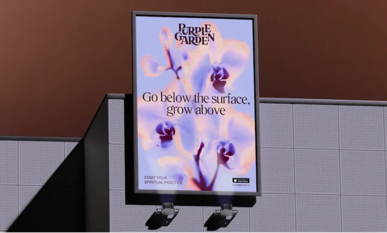
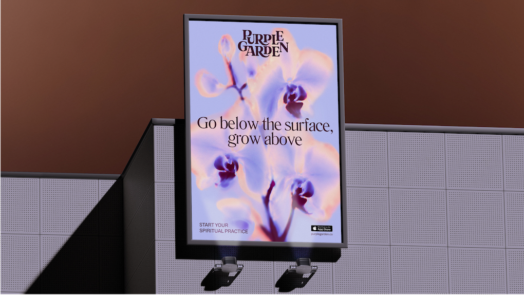
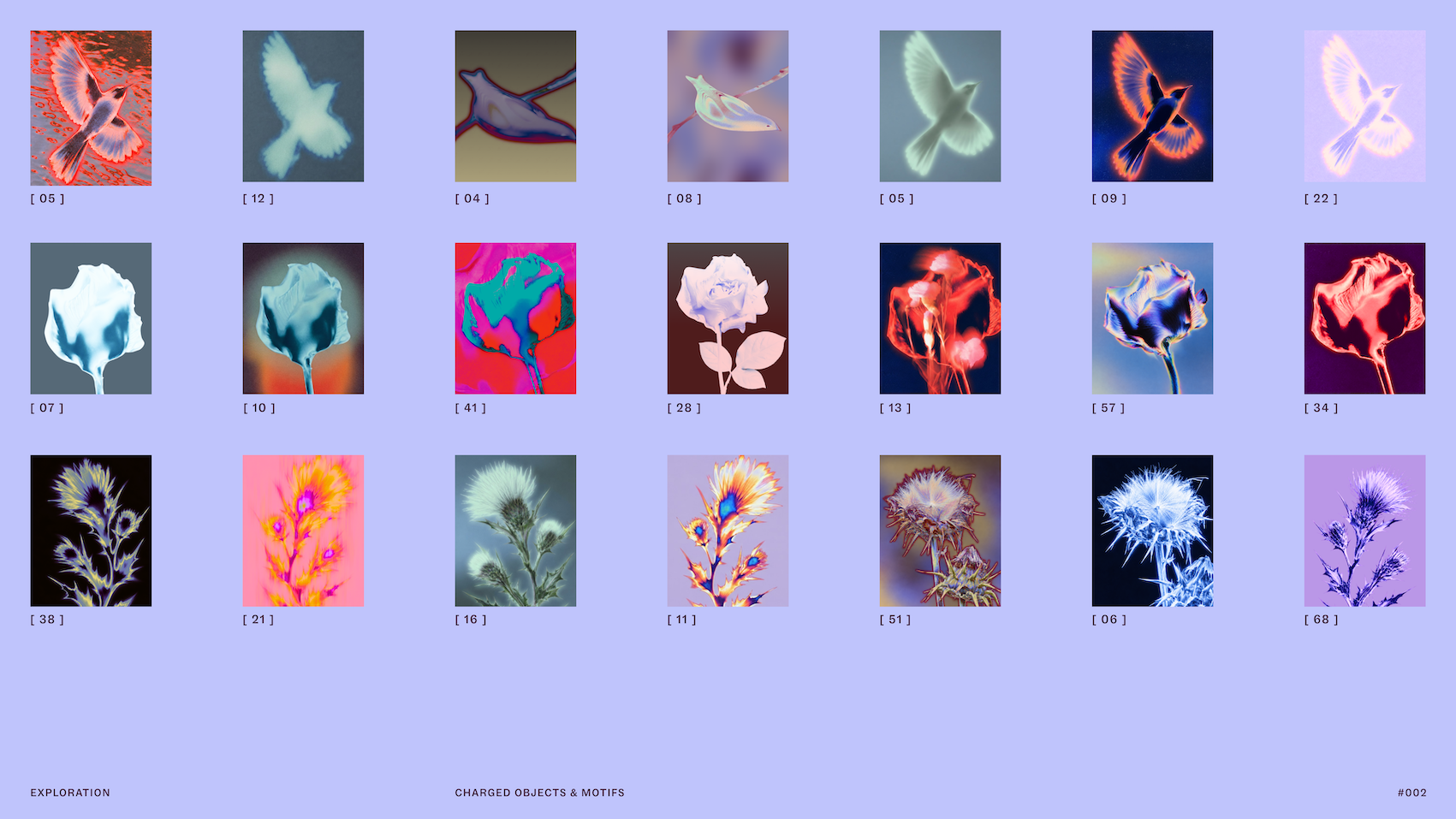
The color palette represents a departure from the "flatter" tones typically found in the wellness and spiritual app categories. Mother Design curated a set of seven distinct hues, centered around a rich, deep purple, to create a sense of depth and dimensionality. This palette is complemented by photography that features "charged objects"—everyday items transformed through solarized glows and flame-like ripples. These visual effects are intended to represent the energetic exchange that occurs between a practitioner and a client during a session, turning static imagery into a representation of active, vibrant energy.
Contextualizing the Market Shift
The spiritual services market, often referred to as the "New Age" or "Mind-Body-Spirit" sector, has seen a meteoric rise in digital adoption over the past five years. According to industry reports, the global market for astrology, tarot, and psychic services is estimated to be worth several billion dollars, with a significant portion of this growth driven by Gen Z and Millennial consumers. These demographics are increasingly turning to digital platforms to replace traditional, in-person spiritual consulting.
As competition in this space intensifies, companies like Purple Garden are finding that a professional, elevated brand identity is no longer a luxury, but a necessity for consumer trust. The "professionalization of the spiritual" is a trend observed across the wellness industry, where startups are competing with established legacy brands by offering cleaner user interfaces, more secure payment gateways, and sophisticated branding that aligns with the premium aesthetics of lifestyle apps like Headspace or Calm.
Strategic Objectives and Professional Challenges
For Jo Tulej, creative director at Mother Design, the project presented a distinct set of professional hurdles. The primary objective was to position Purple Garden as the undisputed leader in its category. To achieve this, the messaging strategy had to undergo a shift. Historically, the psychic services category has relied on high-pressure, urgency-based marketing—phrases like "Act Now," "Your Future Awaits," or "Call Immediately" were industry standards.
Mother Design consciously rejected these tropes. Instead, they developed a brand voice centered on the concept of "Active Contemplation." This messaging strategy acknowledges that the user’s journey is not always linear. By creating a tone that can pivot between providing direct guidance and allowing for quiet, reflective moments, the brand successfully mirrors the experience of a thoughtful spiritual consultation.
"Transferring something as intangible as psychic power into a brand identity was a chunky challenge," Tulej noted in a recent reflection on the project. "It had to begin with the audience. We had to create something visual and verbal that would feel familiar and resonate with these ‘seasoned seekers,’ but in a fresh way that would communicate an elevated offering."
Broader Implications for Branding Agencies
The Purple Garden rebrand serves as a case study for how agencies can integrate unconventional, process-led research into their workflows. By stripping away the pressure of immediate KPIs during the conceptual phase, Mother Design was able to foster a level of creative vulnerability that is often suppressed in high-paced agency environments.
The experiment also highlights the growing importance of "experiential research" in branding. When a product or service is highly subjective, the gap between the designer’s perspective and the user’s experience can be wide. By literally participating in the service, the designers reduced this gap, resulting in an output that feels more cohesive and intellectually grounded.
Future Outlook and Brand Sustainability
The success of the Purple Garden identity lies in its ability to function as a "world" rather than a set of disjointed graphic elements. From the interaction between the charged objects and the living typography to the consistent, calm voice of the copy, every element serves to reinforce the concept of a "Living Practice."

As Purple Garden continues to scale, this new identity provides a flexible foundation for future service expansions. Whether through app updates, social media engagement, or physical collateral, the brand is now equipped with a visual system that is both distinct enough to stand out in a crowded market and versatile enough to evolve alongside the changing needs of its user base.
In conclusion, the collaboration between Mother Design and Purple Garden marks a significant moment for the intersection of spirituality and digital design. By treating the intangible with a rigorous, albeit experimental, creative process, the project demonstrates that even the most abstract categories can benefit from a thoughtful, high-design approach. As the digital wellness industry matures, this rebrand may well serve as a blueprint for how platforms can balance the need for commercial authority with the delicate, personal nature of their services.
Related posts: